Visual Rhetoric

The modern world hinges on the ability to create better user experience through carefully crafted design.

Map Design 3

When I got to campus I parked in the parking garage and began collecting data by recording my step count on the Fitbit. I started walking towards the campus center making sure to stop at the entrance of each of the buildings on my way directly in front of the door to record the step count at that point.

However, due to the cold and the snow, Ryan was hesitant about having to count steps and thought it might be faster to use a GPS app to just calculate distance walked, such as a fitness app that measures your run distances. We weren’t sure which would be easier, counting steps using a Fitbit, which might give more directly relevant results, or distance, which could be more broadly applied.

During our outline process, we decided where we would generally have lines placed, showing the areas and paths that we felt were most commonly walked along. We kept refining our line placement and divided the places where we would walk.

However, as we were figuring out which places to walk to and in which order, it dawned upon me to just use Google Maps. I remembered that it had a tool to measure distance between two points, and in fact we found out that you can trace a path and it will calculate the distance along it. As a result, we ended up just using that for the maps.

We inputted all of the data into an Excel spreadsheet and annotated our outline with the specific data that we wanted to include.

All that’s left to do is take the data and the outlines and make them polished.

Map Design 2

At around 8:00 pm, Ryan called regarding another potential idea, styling our map around the MBTA subway map but showing instead the walking distance between buildings around campus. Immediately I looked for various references on the subway map theme, such as the MBTA map itself, New York’s subway map, and London’s Tube map.

MBTA SUBWAY MAP

NEW YORK MAP 1

NEW YORK SUBWAY MAP 2

I was fascinated by the two different styles of the New York subway map, with 1 being more geometric design versus 2 being more spatially accurate design.

LONDON

Eventually we decided to go with a map design based on the number of steps it takes to get from the Campus Center to anywhere else. We thought it would be relatively easy to gather data by walking between the buildings around campus. Using a Fitbit to count the steps makes that significantly easier as we just have to record the starting and ending step count and input them into Excel to calculate all of the delta values. However, the snowstorm on Saturday significantly disrupted our plans, and we were forced to postpone our planned data collection meeting until Sunday.

In the meantime, however, we decided to continue refining the idea and make an outline of what we imagined our map to look like. Starting off with a published map of the WPI campus, we annotated possible main routes based on what we felt were most traveled by students, trying to figure out the best way to connect them.

The subway map style can be a bit restricting because people don’t generally walk the exact same path and instead almost always take the shortest path. This becomes a problem when two buildings are next to one another yet people take different paths to get there. To illustrate an example, we looked at Daniels and Riley, which are quite close. However, when walking from the Campus Center to Daniels, students generally go around Bartlett towards the Quad. When walking to Riley, they generally go in front of Bartlett. This is not how a subway would be built; if this were a real subway, one line would be built that passes both Riley and Daniels and to go to either, the path would be slightly longer. As a result, after much debate on the extent to which we would follow the style, we decided to take some liberties and not necessarily follow it to the T :)!

Our idea of using a subway map to represent walking distance was already a slight departure from the style, because distance is generally not to scale on the subway map. This made deviating from the style a bit easier, but we still debated the extent for hours.

In order to best represent the walking distance, we thought of making the distance between the dots to scale and potentially including the number of steps between each building or the total number of steps from the Campus Center. We decided that we would go with a relatively geometric design (in keeping with the style) but maintain a spatially accurate scale that would convey the steps it would take to walk. We decided to table the issue of whether or not to include the number of steps and figure that out later.

Map Design 1

Today, people are not as familiar with paper maps due to the advent of GPS and smartphones. Specifically, I have noticed that people struggle with orienting themselves on paper maps or with respect to various landmarks when in unfamiliar places and navigating without GPS. This becomes an acute problem in the air, when pilots are trying to fly visually (i.e. not in instrument conditions or when their GPS is not functioning properly). Knowing your position is critical when near controlled airspace, such as the Class B airspace, and in high air traffic density locations, such as in Boston or New York.

Worcester has an airport that is in Class D airspace, meaning that to enter, you simply need to establish two-way radio communication with the control tower. However, at night, when the tower is closed, the airspace becomes Class E, meaning that there are no specific requirements to enter, as long as you remain in visual conditions and are able to “see and avoid” other aircraft, although it is highly encouraged that you still use effective radio communication and remain extremely vigilant. Aviation maps serve to augment the visual understanding of the environment with respect to terrain, visual landmarks such as roads, rivers, and lakes, and of course help visualize the abstract airspace classifications.

As a side note, I think that it is always a good thing to be able to navigate without modern tools as a skill. This is known as “pilotage,” and was crucial before the use of GPS, radio beacons (VOR), and other modern navigation aids, to better understand how to effectively use those tools. I liken it to how it is much better to learn math first without a calculator to fully understand the conceptual aspects. This ends up making the use of a calculator more effective and allows better application of concepts, especially important in today’s world where new innovation comes primarily from the intersection of diverse disciplines and pre-existing methodologies have been exhausted, requiring a unique perspective.

But I digress. As much as I enjoy discussing philosophy, let’s go back to the maps project brainstorming. Our project is to develop a map of Worcester that presents valuable information in a unique way. After class, I spent quite some time poring over aviation maps of Worcester and as such being familiar with them and being especially interested in drones, I wanted to base something on that idea, possibly related to where drones can be flown based on terrain data. I imagined a map that showed where it would be legal to fly a drone and where it may not be, augmented with the terrain data of where it is safe to fly a drone and where it might not be.

This idea definitely needs to be refined, and may be even outside of the scope of the projected timeframe. I think it is feasible though if I use ESRI ArcGIS, something we learned about in Business Communication, taught by Professor Faber. Regardless, I will be working again with Ryan LaPointe, so we may be able to come up with a better idea. We decided to brainstorm various topics overnight independently and discuss our ideas with each other the next day. Hopefully we will have an interesting project that can be relatively simple for the limited timeframe.

Comic Design 3

Attached is our artist statement.

The purpose of the comic is to show first and second year students who may be hesitant about taking humanities courses that the thematic approach may be more fun and intellectually rewarding than the traditional depth and breadth approach. As such the audience is primarily intended to be WPI students who are in the engineering field and are reluctant to take humanities classes. The narrative follows two WPI students who are discussing the humanities requirement and learn that the thematic approach may be a better format to pursue their specific interests, in this case, anime. We wanted to appeal to ethos by building in a relatable experience to connect with the audience. John, having already completed his humanities requirement in “Medical Humanities and Ethics” describes the possibilities and flexibility that the thematic approach offers, specifically giving examples of how Matt may be able to complete his humanities requirement thematically in Japanese Popular Culture in order to coincide with his interest in anime. The ending broadens the scope so that the comic may be more relatable with any topic, rather than just anime.


EDIT: 12/8/2017

We needed to revise our artist statement to better reflect why we did what we did instead of what we did.

The purpose of the comic is to show our audience that the thematic approach may be more fun and intellectually rewarding than the traditional depth and breadth approach to the humanities requirement. The audience is primarily intended to be first and second year WPI students in the technical disciplines who may be hesitant about taking humanities classes. In order to establish ethos with the intended audience, we put the characters in a situation that is relatable; specifically, we introduce a student who is struggling to figure out how to best complete his humanities requirement. When he is approached by a friend who assists him with the humanities requirement, we intended to allude to WPI’s ideology of peer learning. This also serves to augment the conditional rhetoric that students are exposed to by subtly encouraging students to help one another find solutions to their problems. We decided to use the theme of anime because to again establish ethos, as anime is a common cultural trope among engineering students and is easily recognizable, even to students not directly familiar with its intricacies. However, students at WPI are interested in a variety of different topics and focus areas, and not everyone is interested in pursuing a humanities requirement in anime, or Japanese Popular Culture as we call it. Consequently, we didn’t want to get too tied into the example of anime. Based on feedback from the class, we decided to broaden the scope towards the end of the comic and make the thematic approach more relevant to any theme that students are interested in. We wanted to make sure to visualize the requirement using something that would be familiar to any WPI student, the degree tracking sheet. We created an example schedule and filled it in the tracking sheet to show how simple the thematic requirement is and what type of thematic relationship can exist between the classes, from Asian culture to animation courses, and an inquiry seminar in media revolutions throughout history. This also served to visualize the the thematic requirement and condense it into a simple and relatable representation that makes the thematic approach more approachable.

Comic Design 2


I used to have a Wacom tablet but it broke (include picture here) the engineer in me wanted to take the pen apart…

I rented one from the ATC for a couple of days

Comic Design 1


I will be working with Ryan Lapointe


Over the years I have watched numerous videos on comic design. I have compiled them here.


I am fascinated by the lettering of comics which really relates well with our previous typography unit and ties it in with this one.


Information Graphics 5

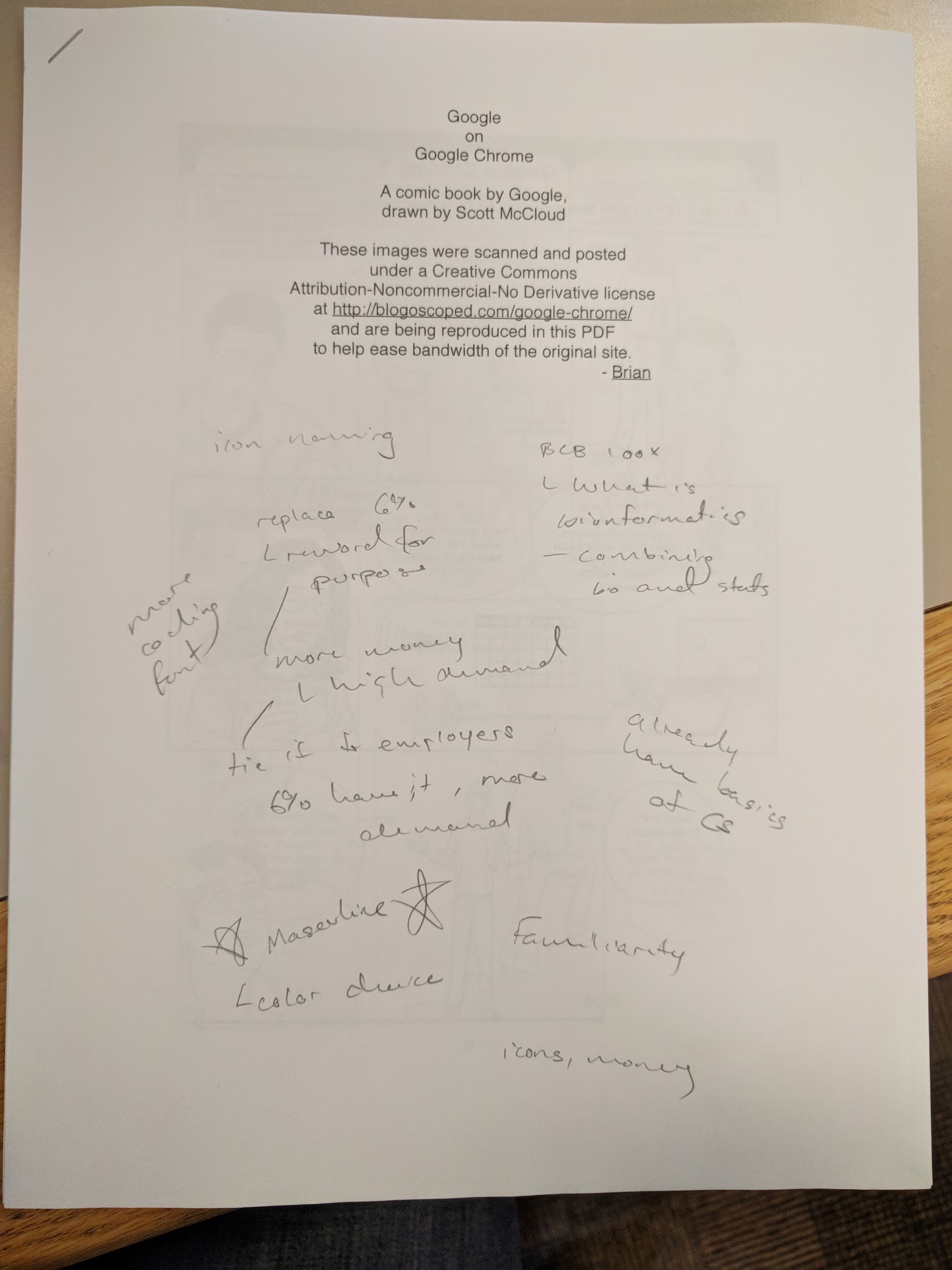
The feedback we received from the class discussion was extremely helpful in guiding our direction for the final draft. We realized that there were a lot of subtle biases that we had incorporated into our design. For example, the iconography for the coding languages, specifically Python, wasn’t as universally understood as we thought and added confusion.

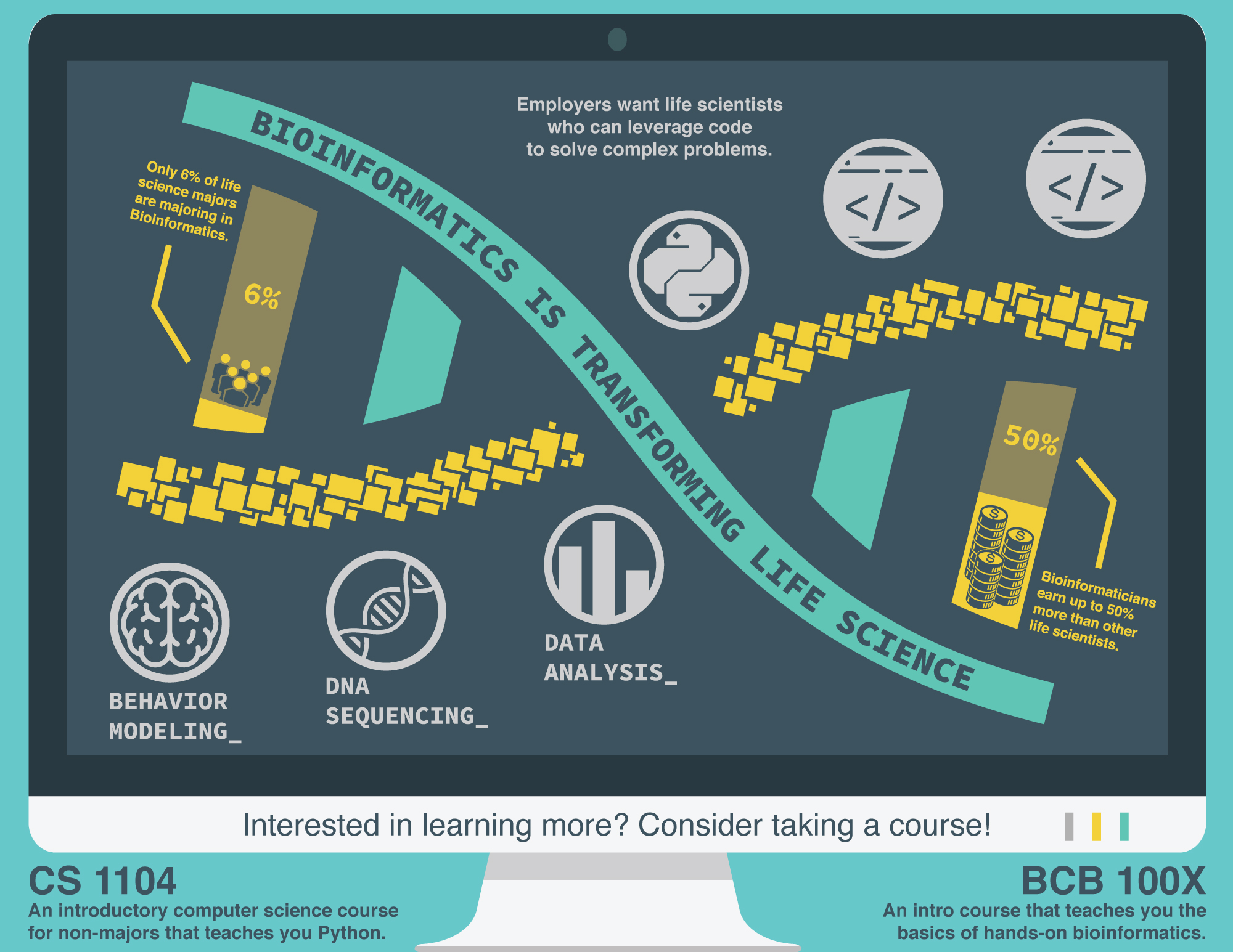
Although not intended, the statistics that we used, specifically the “6 percent of life science majors are majoring in bioinformatics,” gave the impression that the information graphic was trying to convince students to major in bioinformatics rather than just take some more computer science or bioinformatics classes to enhance their knowledge. This is an important distinction, because the idea of switching majors or adding an additional major requires much more effort and thus is more challenging to persuade people to do.

In addition, our target audience includes those who have never taken any computer science courses, or who have just lightly dabbled in it. The majority of people majoring in the life sciences majors, in particular biology, are female. Consequently, we decided to further narrow our target audience to female biology students at WPI. This allows us to craft a more targeted message that will hopefully be better at persuading them to take enhance their computer science knowledge.

Some inherent, albeit extremely subtle design choices, made our information graphic seem catered to a male audience more familiar with computer science, such as the iconography, color scheme, and monetary statistics. Generally, women are less drawn to the prospect of a lucrative career than men.

Based on the feedback, we further refined our target audience to be as specific as possible, narrowed down from biology students at WPI to female biology students at WPI, with our purpose being to convince them to take a computer science or bioinformatics course. We also decided to reduce the emphasis on the bioinformatics major to prevent any confusion with the understood purpose previously mentioned.

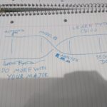
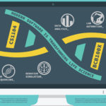
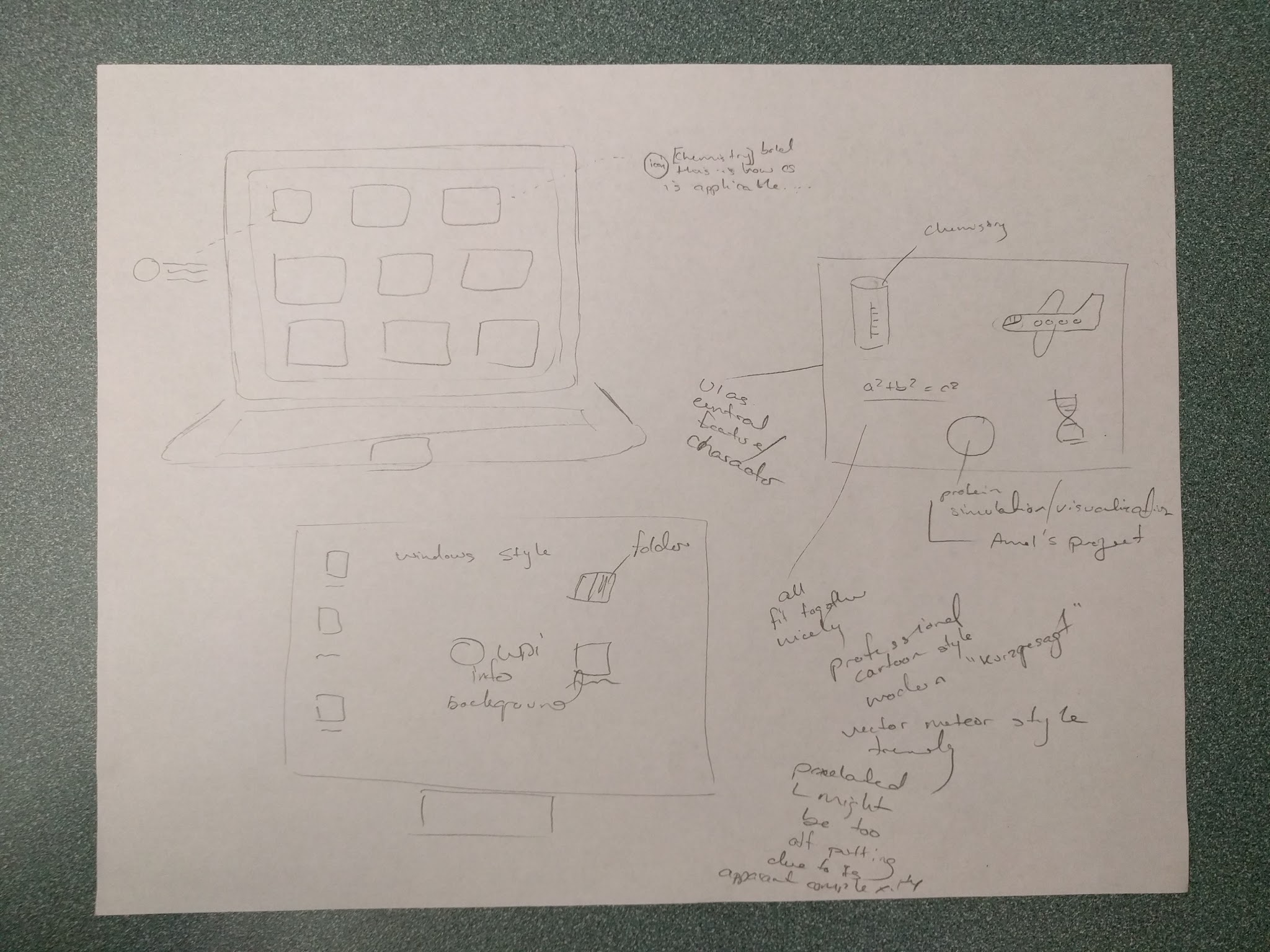
Based on the feedback we received from class, we decided to continue with the simple iconography and general style, but modify it to better fit our target audience. We used the principle of relatability by showing images of females in science, however as icons to fit our style. We had some difficulties finding a good icon that would match our initial idea of a female with a ponytail wearing lab goggles (so to be instantly recognizable as both a female and a scientist), potentially holding a beaker or Erlenmeyer flask to be even more identifiable. Some of the icons that we found are included with the first being a quick sketch courtesy of Henry 🙂 .

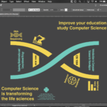
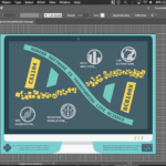
Our next progression of drafts over the weekend are as follows.

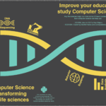
Our final draft (for now at least).

Because of the many changes that we implemented as a result of the feedback session (which I think was extremely useful!), we also changed our artist statement:

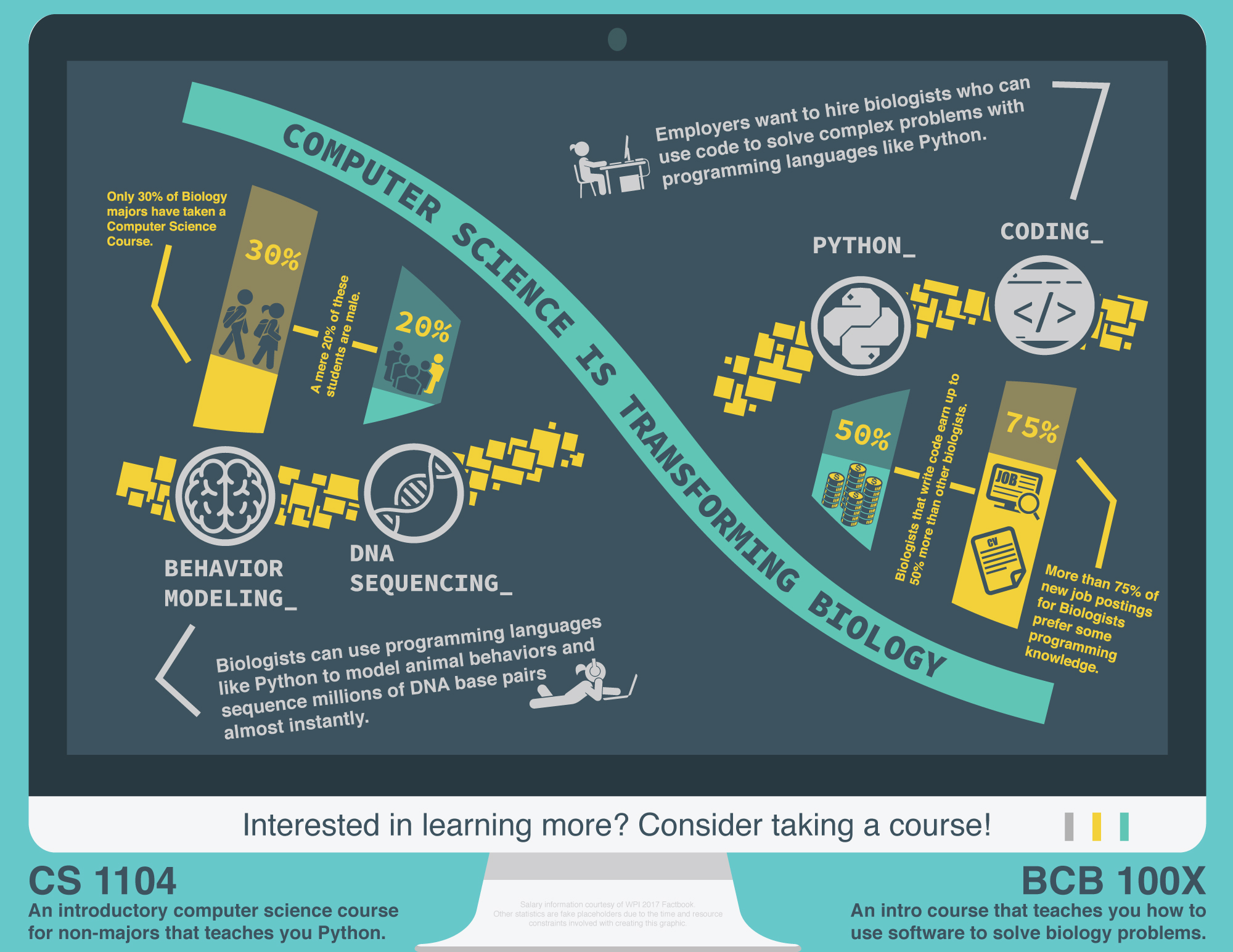
The purpose of this information graphc is to persuade biologists at WPI to take computer science (CS) courses by showing them how CS can impact their carreers.

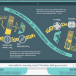
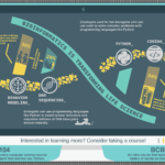
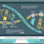
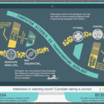
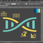
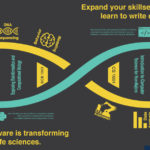
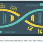
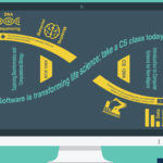
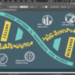
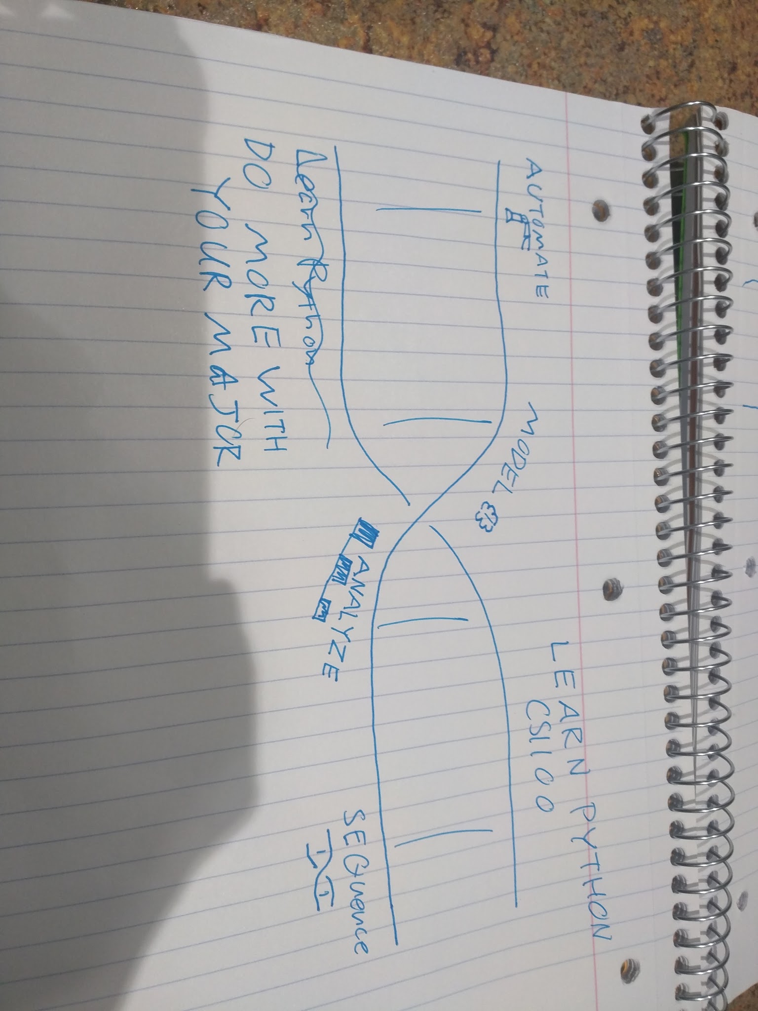
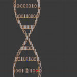
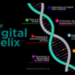
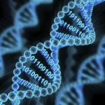
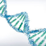
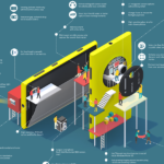
To accomplish this goal, we began by molding our graphic around a DNA strand, immediately telling viewers that our graphic is about biology. By slightly tilting the DNA, we are able to guide the readers eyes as they read from the top left to the bottom right. Symbollically, the DNA has been broken into two strands: solid teal and pixelated yellow. The teal strand represents biology, while the yellow strand represents CS; together, they show how CS and biology are fundamentally intertwined within our graphic. We used the vertical bars between strands to hold statistical information, drawing from a variety of statistics (tragically fabricated due to time and resource constraints) in order to logically persuade our readers into learning more about programming.

Contrasting the DNA, we framed the entire infographic within a monitor (alluding to CS), placing information about beginner CS courses in the empty space surrounding the monitor. We were able to further expand on the DNA with carefully chosen iconography that is representative of the various problems that biologists face, accompanying these icons with subdued text blocks that provide detailed explanations of the icons and their relevance. Throughout the graphic, we attempted to place a larger focus on female viewers, since they comprise a majority of WPI biology majors.

Information Graphics 4

The final design is almost complete! Our group met up on Saturday to complete the information graphic itself and work on the artist statement describing what the graphic means, what it is meant to do, and how it is meant to do that.

EDIT: The final information graphic was originally due on 11/20/2017, however, the entire class has been given an extension to 11/27/2017.

The purpose of this information graphic is to show life science students at WPI how bioinformatics and software impact biology in order to persuade them to take the CS1104 and BCB100X courses. To accomplish this, we made the central focus of the graphic a DNA helix, a choice which served both symbolic and logical purposes. DNA symbolizes biology through its fundamental association with the life sciences. Its structure consists of two intertwined strands connected by base pairs; one strand has a teal color representative of science and biology, while the other has a pixelated, digital motif which evokes the notion of computer science. These connotations, combined with the linked nature of DNA, convey the idea that computer science and biology are fundamentally intertwined. The base pairs connecting the two strands further imply a strong link between the disciplines, while providing statistics to enhance the message. The statistics point to the lack of interest in bioinformatics within the life sciences, and the financial benefits to pursuing it as a career. In addition to this data, each of the three lower icons show concrete examples of problems in biology that computer science can solve, thus providing a logical basis for taking a computer science and bioinformatics course. The entire diagram has been tilted to help guide the eye naturally along the DNA, and icons have been positioned around the molecule to provide peripheral information to the viewer as they read the headline.


I have included a gallery of the progression of our drafts:

Information Graphics 3

As we discussed our drafts in class, Professor deWinter suggested that we significantly narrow the scope of our information graphic. As I mentioned in a previous post, the purpose of an information graphic is extremely important. Our original purpose was to persuade non-majors at WPI to pursue computer science, specifically programming, and apply those skills to their specialty. However, our narrowed purpose is to persuade biology majors to learn programming and bioinformatics to apply those skills to biology.

We started out with our computer monitor idea shown below.

Our methods to accomplish the purpose, “the means of our rhetoric” remain unchanged, essentially showing specific examples of how computer science is applicable in biology and bioinformatics.

Immediately, we went to the idea of using a DNA molecule to represent the idea of biology, a common trope, which we continued to elaborate on. However, we realized that the idea of framing our infographic in a computer monitor might add some interest and serve as a tonal element conveying the idea of computer science. Consequently, we thought it would be good to continue incorporating it into our design.

I have included a gallery of our research and inspiration for the DNA molecule and how to best include it as the central focus of our infographic.

As an aside, Professor deWinter mentioned this in class. I was fascinated by this thought because it never occurred to me that I could be so easily pulled in by rhetoric. But this is exactly why we strive to better understand rhetoric, so that, according to Aristotle, we may endeavor to discover in any particular case all of the available means of persuasion. As such, the professor mentioned that there is no such thing as a “general audience.” Instead, a general audience is when you are part of the audience, thus causing a feeling of shared generality, that everyone shares your viewpoint.

Information Graphics 2

After a bit of deliberation, we decided to go with the idea of persuading WPI students who are not computer science majors to learn programming and apply their knowledge to their specific field.

Although I was a bit sad to let go of the idea of automation in white collar jobs and the role of artificial intelligence and machine learning in that trend, I realized that it might be a bit too difficult to effectively research and explain in a single page information graphic. Creating an effective narrative would also be significantly more challenging since, with the exception of Brandon, none of us have any specific job experience in the field outside of school. However, the topic that we did chose had some elements of the automation idea, in that we decided to include applications of computer science on the various majors, and how they might be able to effectively leverage artificial intelligence and machine learning in their fields.

Based on some ideas by Brandon, and after some discussion with Henry, I drafted our ideas on paper. We thought that framing the information graphic in a computer monitor might be a really interesting idea, as if the content was part of the computer itself. We first thought of having a “word cloud” style image, but instead of words, replaced with icons representing the applications of computer science to other fields. However, going off of the idea that the information graphic was part of the computer frame, we also thought of using icons explaining the various applications of computer science to other fields, as if they were computer applications installed on this machine. This idea was slowly abandoned in favor of a more clean and minimalist approach, vaguely resembling the colorful “professional flat cartoon” style that is trendy today,.

I have included a gallery for our inspiration research and infographic ideas:

I found this resource if anyone ever need a pixel map generator, http://pixelmap.amcharts.com/

Page 15 of 16

Powered by WordPress & Theme by Anders Norén