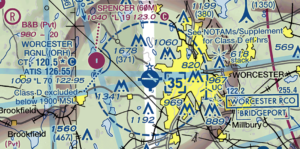
Today, people are not as familiar with paper maps due to the advent of GPS and smartphones. Specifically, I have noticed that people struggle with orienting themselves on paper maps or with respect to various landmarks when in unfamiliar places and navigating without GPS. This becomes an acute problem in the air, when pilots are trying to fly visually (i.e. not in instrument conditions or when their GPS is not functioning properly). Knowing your position is critical when near controlled airspace, such as the Class B airspace, and in high air traffic density locations, such as in Boston or New York.
Worcester has an airport that is in Class D airspace, meaning that to enter, you simply need to establish two-way radio communication with the control tower. However, at night, when the tower is closed, the airspace becomes Class E, meaning that there are no specific requirements to enter, as long as you remain in visual conditions and are able to “see and avoid” other aircraft, although it is highly encouraged that you still use effective radio communication and remain extremely vigilant. Aviation maps serve to augment the visual understanding of the environment with respect to terrain, visual landmarks such as roads, rivers, and lakes, and of course help visualize the abstract airspace classifications.
As a side note, I think that it is always a good thing to be able to navigate without modern tools as a skill. This is known as “pilotage,” and was crucial before the use of GPS, radio beacons (VOR), and other modern navigation aids, to better understand how to effectively use those tools. I liken it to how it is much better to learn math first without a calculator to fully understand the conceptual aspects. This ends up making the use of a calculator more effective and allows better application of concepts, especially important in today’s world where new innovation comes primarily from the intersection of diverse disciplines and pre-existing methodologies have been exhausted, requiring a unique perspective.
But I digress. As much as I enjoy discussing philosophy, let’s go back to the maps project brainstorming. Our project is to develop a map of Worcester that presents valuable information in a unique way. After class, I spent quite some time poring over aviation maps of Worcester and as such being familiar with them and being especially interested in drones, I wanted to base something on that idea, possibly related to where drones can be flown based on terrain data. I imagined a map that showed where it would be legal to fly a drone and where it may not be, augmented with the terrain data of where it is safe to fly a drone and where it might not be.
This idea definitely needs to be refined, and may be even outside of the scope of the projected timeframe. I think it is feasible though if I use ESRI ArcGIS, something we learned about in Business Communication, taught by Professor Faber. Regardless, I will be working again with Ryan LaPointe, so we may be able to come up with a better idea. We decided to brainstorm various topics overnight independently and discuss our ideas with each other the next day. Hopefully we will have an interesting project that can be relatively simple for the limited timeframe.


Greta S. Jarvi
Right off the bat it is really cool to learn about maps with regards to aviation! I don’t think I would have ever had the curious to find this out for myself. Regarding drones, I am not up to date with regulations and rules for them, but my partner had mentioned that we could create our map to relate to drones as well, (our map is about WiFi). I think that two groups, independent of each other, coming up with a similar idea shows the importance of drones in the future.
In class on Monday, I was able to get a look at your current map, WPI in the form of a subway system. I really liked the simplicity of the map and its clean feel. Many times when I go to a new place, I am often confused by how to get from A to B because the maps include every tree, every little area of grass. I think there is a lot of unnecessary information that does not enhance my understanding of where I am. Your interpretation of creating a subway map to help people efficiently get around WPI is very valuable because it provides the important information. The only suggestion I had was to make the names of the places slightly bigger, but overall I loved it!
admin
Thanks Greta! It’s great to hear that you find this map useful because we were initially very concerned that although cool, people wouldn’t actually be using the map in their day to day lives. I honestly think the condensed style could go either way, sometimes it’s nice to have more information to figure out where you are by maybe orienting yourself to visual landmarks on the ground, but sometimes you just need to know the general best path to go from the Campus Center to another. As much as we tried, we just couldn’t figure out a way to make this map be truly point to point – all trips (at least if this map were to be useful) must originate at the Campus Center. This is a limitation of representing 3D space and walking paths as subway paths which are much less fluid. A lot of people commented that the map text was too small, and I agree that on the computer screen it definitely appears so. However, when printed, I think it seems normal because you are able to resolve more of the detail easily on a piece of paper than on the computer screen for some reason. We also thought of printing it at poster size and having it hung at the Campus Center as opposed to being distributed directly to students on paper. I’m honestly not sure which would be better, maybe even both!