The modern world hinges on the ability to create better user experience through carefully crafted design.

Month: December 2017

Final Project 3

My final revision of the font is complete!


The artist statement is as follows.

Frigid was designed as a title typeface for the Escape Room, “Revenge of the Yeti,” held at Worcester Polytechnic Institute. The escape room was themed around an icy mountain expedition gone wrong when the group is confronted with a Yeti and has to figure out what to do! Once called Ice Pick, the typeface was renamed to Frigid to better reflect its new focus on the sense of cold, frigid temperatures and the panic that someone would feel on such an expedition. The sharp features, especially evident on the I, symbolize icicles.  However, the P was designed to be almost exactly the same shape as a piton, a metal spike that is driven into the rock or ice to make a hook that they can attach their safety gear to. The typeface is designed to convey the icy bite of the frigid temperatures and evoke a sense of danger and fear from the sharp, claw-like serifs intended to be reminiscent of the feeling of a Yeti around the corner, and overhangs that elicit the feeling of being trapped in an ice cave. The large, all-caps letterforms provide an emphatic sense of urgency that can be used in banners and logos as well as in title cards and event flyers. Frigid was designed to use pathos to invite readers to feel the same emotions that a group of trapper mountaineers would when faced with the frigid temperatures, mountainous terrain, and harsh winds. The letters in Frigid have distinctive icicle-like features incorporated into the letterforms, especially evident with the letter “I.” There are harsh angles and sharp, curvy wisps built into the letterforms that exude the feeling of strong, chilly winds biting into your face. The letters also incorporate features of tools commonly used on mountainous terrain such as the letter “E” being the spikes on a climbing boot. Yet at the same time the typeface was designed to be geometric so that it can be applicable to a number of different use cases.

Final Project 2

I realized that although the comic needs to be polished up, I wanted to work on redoing the typeface project so that it could be more useful as an actual typeface and hopefully be used.

I decided to also work on my font and bring it into better shape. I thought that using the hand drawn approach really adds character to the font and helps convey the vision of a scary Yeti being around the corner and the cold temperatures. However, hand drawing all of the letters with pencil, as we did, made the font be an outline instead of completely filled. We didn’t have much time to fix that during the font unit, so I thought it would be great to go back and really make the font a complete and polished typeface. Also, the outline occasionally had slight breaks in it due to the variations in stroke that the scanned pencil lines had. In addition to filling in all of the letters, I decided to give the font a more cohesive look by redoing the entire second half of the alphabet according to the same style that I drew the first half in. I also wanted to add some more punctuation marks so that the font would be more usable, such as a question mark and a comma. Although I think adding the lowercase glyphs would be interesting, I think it is outside of the scope of this project. Instead, I decided to make the entire font be in capital case by replacing all of the lowercase glyphs with the uppercase glyphs, so that no matter how you type, whether it is in a lowercase or using caps-lock, the letters always appear and they appear to be capitalized. That was one problem with the previous draft, because if someone typed in lowercase, the glyphs would be replaced with standard glyphs or with an unknown character mark. Some fonts already do this same thing where no matter which case you type in the letters are capitalized. For example, Algerian and Castellar do this.

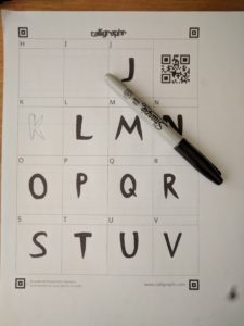
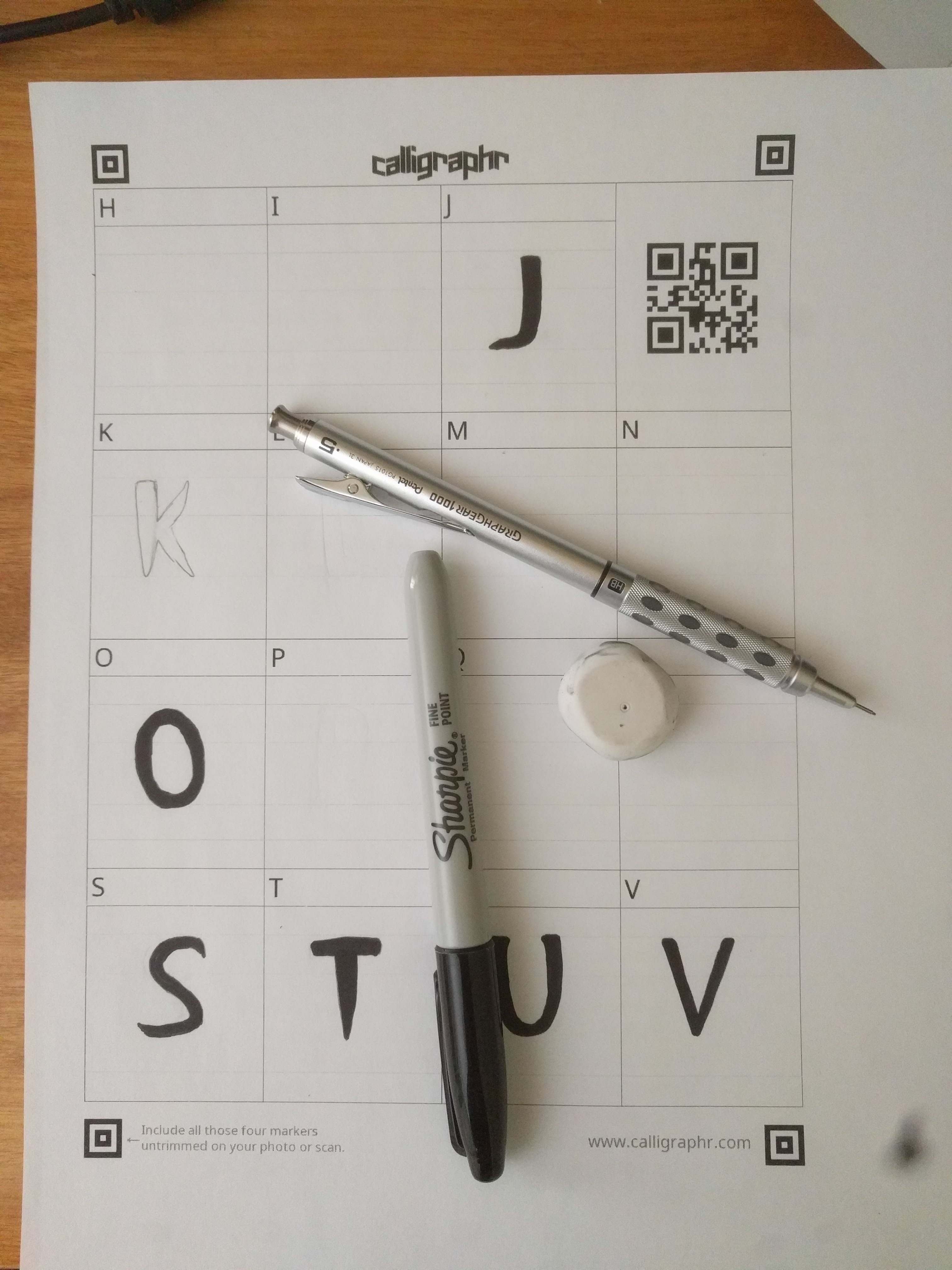
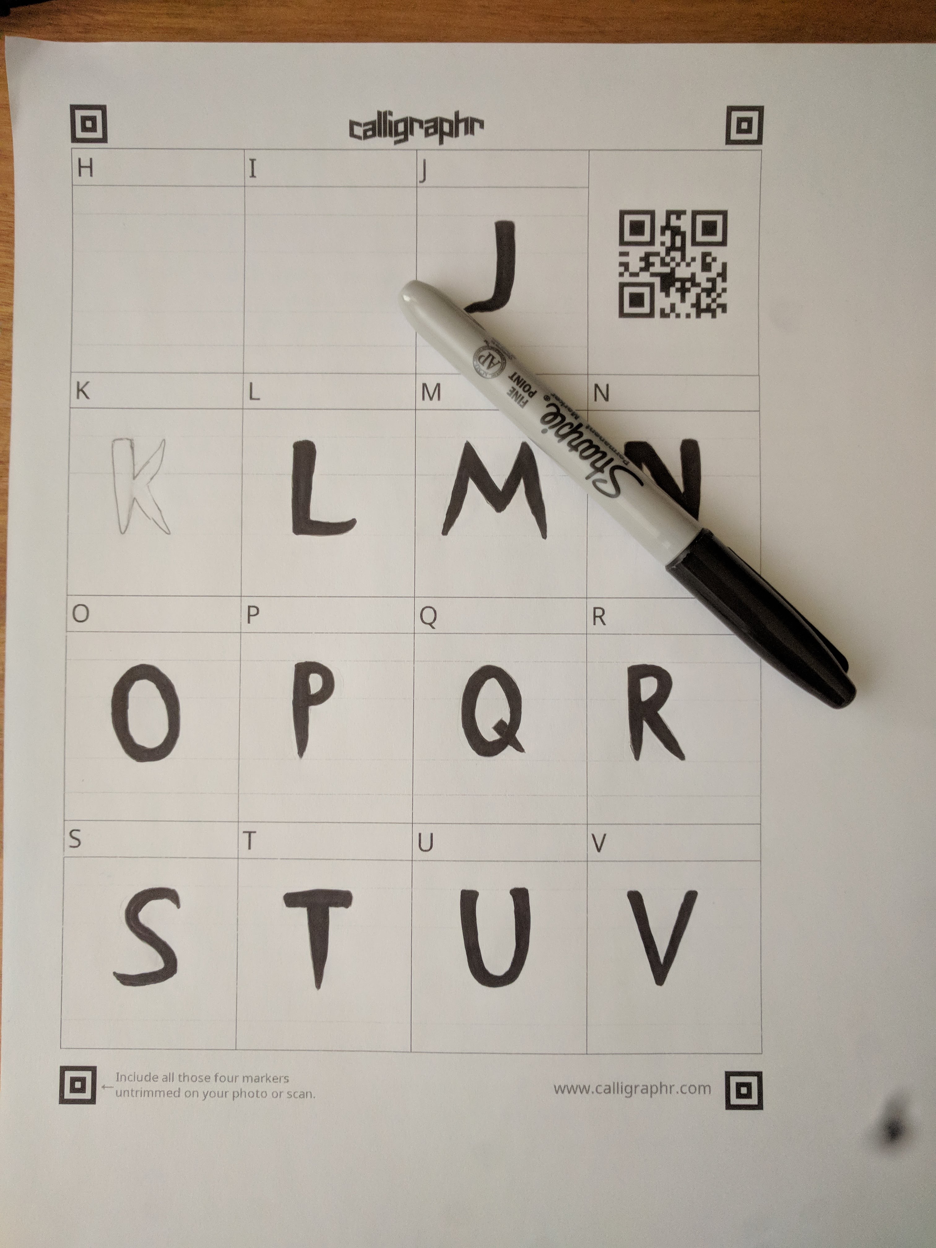
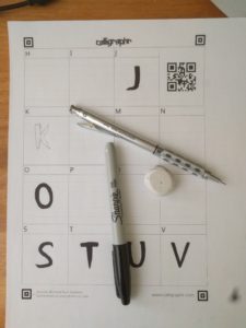
In order to create the filled letters, I used a sharpie instead of a pencil, and made sure to fill in any areas with ink instead of leaving them empty. This also made the letters much darker and thus easier to scan in. I used Calligraphr again to turn the scans into an actual font and downloaded the OTF file from there. I honestly thought it would automatically fill everything in to make the final letterforms, but instead it used the scans as is. I used their template called “Minimal English” which contained the most frequently used characters, including punctuation such as a colon, comma, and quotation marks. However, to make sure that I didn’t make any mistakes, I first drew the glyphs in with a pencil and went over it with sharpie.

As much as I wanted to reuse the glyphs I had already drawn, the first half of the alphabet and the punctuation in the previous draft, I decided to redraw all of them which took significantly more time. However, this made sure that the entire font was cohesive and fit the same style rather than having a clear split in the middle of two slightly different ideas.

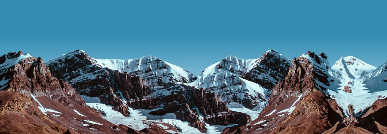
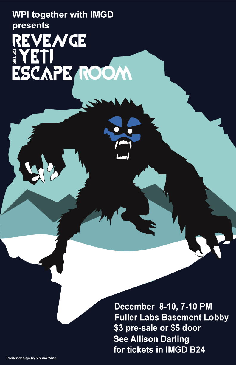
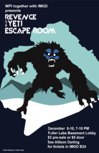
I want to reiterate the intended purpose of the typeface. It was designed for an escape room held at WPI, themed around an “Escape from the Yeti” during an expedition to Mount Everest. Some of the terms we were given to research are listed below. Because my second draft font still has the same general stylistic elements as the previous, I used the same inspiration images to help bring the style to life.

  • Everest expedition
  • Sherpas
  • Cold
  • Tents
  • Oxygen
  • Yeti


As previously I wanted to keep the font in a geometric style so that it can also be used outside the scope of this project and in other cases.

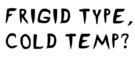
I decided to rename the font from “Ice Pick” to “Frigid,” which I thought better represented my intentions with the typefaces and also served to broaden the potential usability of the font. Instead of focusing on the Yeti aspect of the design, I decided to focus more on the cold, frigid, part. This decision made the entire project more challenging because representing these concepts with simple geometric shapes is much more difficult than if I were to use a more literal typeface, such as by sweeping the letterform in Photoshop or in Gimp to have an icy look.

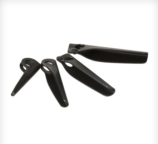
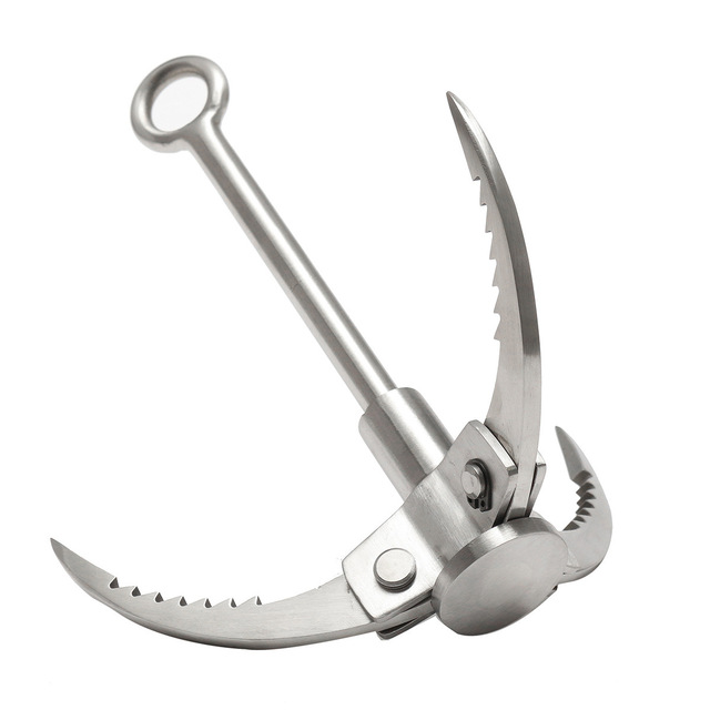
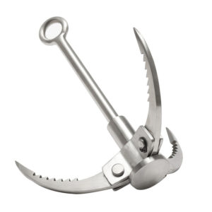
The period and point of the exclamation mark were intended to resemble an ice cube, as well as the period and comma. However, the comma and semicolon were intended to resemble the teeth of the Yeti. The question mark was styled to look like a grappling hook that a mountain climber might use. However, the P was designed to be almost exactly the same shape as a piton, a metal spike that is driven into the rock or ice to make a hook that they can attach their safety gear to.

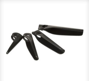
By using the serifs around the C, the letterform was intended to resemble the tool that ice harvesters would use to grab ice out of the water.

Although I wanted to add some more elements of the Yeti to the O, I decided against it so that the font would be more usable in different cases. The Q resembles the O as if someone drove an icicle through it.

I decided against using a vector based typeface designing program such as Type Light or Illustrator because I felt that I would lose the essence of the font. Hand drawing the letterform gives a character to the typeface that is almost impossible to achieve with digital programs despite the numerous advantages that they do provide. Before uploading my scans to Calligraphr, I modified and fixed up certain elements that I had messed up slightly or wanted to be more refined in Gimp.

Map Design 6

Our final draft of the WPI Walkability Map is complete!

Our artist statement is as follows:

The purpose of our subway-themed walkability map is to show students in the Campus Center the time it takes to walk to various buildings around campus in order to help them plan their schedule and show the severe impact of the construction site and the delays it causes between certain parts of campus. The intended audience of our map is WPI community members in the Campus Center, and we plan on having the map printed at poster size and hung on a wall or near the door. To accomplish our goal, we designed our map to have some of the same visual characteristics as the subway style of the MBTA rapid transit map. We intended that these deliberate design choices would subconsciously make the map familiar to those from around the Boston area and assert its authority by making it seem as if it were an official document. We styled the color choice to match that of the MBTA, the font used for the labels, as well as the style of the legend. The deliberate similarities also extend to the way the names of the last stop are written in all caps and bold, the labeling of the individual lines, as well as the nomenclature of the lines themselves as colors (i.e. green line, red line, etc.). The silver color of the “construction bypass” line on our map is a subtle reference to Boston’s silver line, which—deceptively—is a bus rather than a train, and as such is slow. A person familiar with Boston’s rapid transit system will get this insider joke and identify more closely with the map. While these stylistic elements will be effective with audience members from this area, others appeal to a broader audience. We decided to have the Campus Center be the central point of our map from which walking times are measured. Because the construction site is directly next to the campus center, and in order to get from the Campus Center to the quad students now have to walk completely around Higgins, the impact of the construction is greatest there. The organization of the lines and stops is done so that more “train transfers” are required to get between certain buildings with the construction site present than without it, which emphasizes the impact. The map style is rhetorically effective because it condenses the pertinent information and presents it in a simple and clean look. There are often significant amounts of unnecessary details in geographic maps, which end up distracting the end user that simply wants to know how to get from one point to another. The subway style helps distill the information and presents only the most important and useful information specifically for transit. However, the style does have some limitations due to its simplicity and geometric look. This map is not intended for giving directions but rather for schedule planning for trips starting from the Campus Center.

Map Design 5

In order to make our purpose clearer, we got advice from Professor deWinter. She made a number of suggestions using her trademark sharpie method – drawing all over a printed copy! This time before presenting it to her, I made sure to include the actual times in minutes which is hopefully much more relevant than distance or steps needed. This took a lot of time to get finished because we needed to calculate the times from each station based on an average walking pace of 3 miles per hour. However, the most challenging part was actually making sure everything was lined up and that the times were all italicized and in smaller font – just a lot of manual labor!

Based on her advice we made a number of changes, as shown below.

At the same time as the map unit we were assigned a final project. However, I just haven’t had much time to muse over what I wanted to do until now. For the final project, I decided to revise and add to the previous comic project and bring it to a more final and “publishable” document. I really like Greta and Ben’s idea of having a fillable worksheet at the end so that the reader can apply the comic story to their own college plan. I thought that it would be really nice to add something like that to our comic so that it could potentially be used at New Student Orientation or as handout material during the humanities requirement presentations. Professor deWinter also mentioned to use Illustrator to convert the hand drawn files to vector graphics, exactly as Caroline and Katie had done with their drawing of Gompei the goat!

As an additional side note, I have commented significantly outside of my blog group. Also, I love Brandon‘s blog style which continues to inspire me to do better documentation on my own site!

Map Design 4

Our first draft of the map was not to scale. However, we soon revised that to make it more clear what we were trying to convey, that is, how long it takes to walk between buildings on Campus.

Our second draft was to scale (as best as possible).

Some feedback that we got from the class was:

  • make the text larger
  • make the map more recognizable as WPI
  • move the Campus Center to the correct location in relation to the fountain
  • make Gateway path less out of scale

Most importantly, however, we realized that the purpose that we intended, to show students how long it would take to get from the Campus Center to another point on campus, was not immediately clear. This is definitely something we need to work on, since our purpose must bend to the limitations of the subway style, even if we were to take many liberties and depart more from the style. Essentially, the important feedback we got was to make our purpose as clear as possible. Because of the subway style, it was necessary to narrow down the map to represent just trips from the campus center. If you were to originate at a different location, you wouldn’t necessarily go on the same path as depicted in the map. Making this clearer is definitely the next step, but something I think will be quite difficult because of the conditional rhetoric of subway maps – people are used to being able to go from any point to another. One possible way to solve this is to simply have the map not be distributed to students and instead be hung on the wall of the Campus Center. This solves the problem of where people start, as well as making the text even larger and easier to read from a distance.

In order to address the problems mentioned above from the feedback session, we spent quite some time after class and made another draft that includes the WPI logo and the text, “Walkability Map; and the impact of construction on commute times” to hopefully narrow down that the map is in fact a depiction of WPI and that we intend for it to be used to determine walking times. We didn’t make the text much larger, but instead we emphasized the ending lines to make it more similar to the MBTA map. We also rearranged quite a bit of the lines to make everything cleaner and evenly spaced. Although, there are still some elements especially towards the core of the map that simply cannot be put into the proper scale, such as the construction area, the distance between Higgins and the Rec. Center, and the distance between the Campus Center and the fountain. Regardless, it is in much better shape than the previous draft.

Map Design 3

When I got to campus I parked in the parking garage and began collecting data by recording my step count on the Fitbit. I started walking towards the campus center making sure to stop at the entrance of each of the buildings on my way directly in front of the door to record the step count at that point.

However, due to the cold and the snow, Ryan was hesitant about having to count steps and thought it might be faster to use a GPS app to just calculate distance walked, such as a fitness app that measures your run distances. We weren’t sure which would be easier, counting steps using a Fitbit, which might give more directly relevant results, or distance, which could be more broadly applied.

During our outline process, we decided where we would generally have lines placed, showing the areas and paths that we felt were most commonly walked along. We kept refining our line placement and divided the places where we would walk.

However, as we were figuring out which places to walk to and in which order, it dawned upon me to just use Google Maps. I remembered that it had a tool to measure distance between two points, and in fact we found out that you can trace a path and it will calculate the distance along it. As a result, we ended up just using that for the maps.

We inputted all of the data into an Excel spreadsheet and annotated our outline with the specific data that we wanted to include.

All that’s left to do is take the data and the outlines and make them polished.

Map Design 2

At around 8:00 pm, Ryan called regarding another potential idea, styling our map around the MBTA subway map but showing instead the walking distance between buildings around campus. Immediately I looked for various references on the subway map theme, such as the MBTA map itself, New York’s subway map, and London’s Tube map.

MBTA SUBWAY MAP

NEW YORK MAP 1

NEW YORK SUBWAY MAP 2

I was fascinated by the two different styles of the New York subway map, with 1 being more geometric design versus 2 being more spatially accurate design.

LONDON

Eventually we decided to go with a map design based on the number of steps it takes to get from the Campus Center to anywhere else. We thought it would be relatively easy to gather data by walking between the buildings around campus. Using a Fitbit to count the steps makes that significantly easier as we just have to record the starting and ending step count and input them into Excel to calculate all of the delta values. However, the snowstorm on Saturday significantly disrupted our plans, and we were forced to postpone our planned data collection meeting until Sunday.

In the meantime, however, we decided to continue refining the idea and make an outline of what we imagined our map to look like. Starting off with a published map of the WPI campus, we annotated possible main routes based on what we felt were most traveled by students, trying to figure out the best way to connect them.

The subway map style can be a bit restricting because people don’t generally walk the exact same path and instead almost always take the shortest path. This becomes a problem when two buildings are next to one another yet people take different paths to get there. To illustrate an example, we looked at Daniels and Riley, which are quite close. However, when walking from the Campus Center to Daniels, students generally go around Bartlett towards the Quad. When walking to Riley, they generally go in front of Bartlett. This is not how a subway would be built; if this were a real subway, one line would be built that passes both Riley and Daniels and to go to either, the path would be slightly longer. As a result, after much debate on the extent to which we would follow the style, we decided to take some liberties and not necessarily follow it to the T :)!

Our idea of using a subway map to represent walking distance was already a slight departure from the style, because distance is generally not to scale on the subway map. This made deviating from the style a bit easier, but we still debated the extent for hours.

In order to best represent the walking distance, we thought of making the distance between the dots to scale and potentially including the number of steps between each building or the total number of steps from the Campus Center. We decided that we would go with a relatively geometric design (in keeping with the style) but maintain a spatially accurate scale that would convey the steps it would take to walk. We decided to table the issue of whether or not to include the number of steps and figure that out later.

Map Design 1

Today, people are not as familiar with paper maps due to the advent of GPS and smartphones. Specifically, I have noticed that people struggle with orienting themselves on paper maps or with respect to various landmarks when in unfamiliar places and navigating without GPS. This becomes an acute problem in the air, when pilots are trying to fly visually (i.e. not in instrument conditions or when their GPS is not functioning properly). Knowing your position is critical when near controlled airspace, such as the Class B airspace, and in high air traffic density locations, such as in Boston or New York.

Worcester has an airport that is in Class D airspace, meaning that to enter, you simply need to establish two-way radio communication with the control tower. However, at night, when the tower is closed, the airspace becomes Class E, meaning that there are no specific requirements to enter, as long as you remain in visual conditions and are able to “see and avoid” other aircraft, although it is highly encouraged that you still use effective radio communication and remain extremely vigilant. Aviation maps serve to augment the visual understanding of the environment with respect to terrain, visual landmarks such as roads, rivers, and lakes, and of course help visualize the abstract airspace classifications.

As a side note, I think that it is always a good thing to be able to navigate without modern tools as a skill. This is known as “pilotage,” and was crucial before the use of GPS, radio beacons (VOR), and other modern navigation aids, to better understand how to effectively use those tools. I liken it to how it is much better to learn math first without a calculator to fully understand the conceptual aspects. This ends up making the use of a calculator more effective and allows better application of concepts, especially important in today’s world where new innovation comes primarily from the intersection of diverse disciplines and pre-existing methodologies have been exhausted, requiring a unique perspective.

But I digress. As much as I enjoy discussing philosophy, let’s go back to the maps project brainstorming. Our project is to develop a map of Worcester that presents valuable information in a unique way. After class, I spent quite some time poring over aviation maps of Worcester and as such being familiar with them and being especially interested in drones, I wanted to base something on that idea, possibly related to where drones can be flown based on terrain data. I imagined a map that showed where it would be legal to fly a drone and where it may not be, augmented with the terrain data of where it is safe to fly a drone and where it might not be.

This idea definitely needs to be refined, and may be even outside of the scope of the projected timeframe. I think it is feasible though if I use ESRI ArcGIS, something we learned about in Business Communication, taught by Professor Faber. Regardless, I will be working again with Ryan LaPointe, so we may be able to come up with a better idea. We decided to brainstorm various topics overnight independently and discuss our ideas with each other the next day. Hopefully we will have an interesting project that can be relatively simple for the limited timeframe.

Comic Design 3

Attached is our artist statement.

The purpose of the comic is to show first and second year students who may be hesitant about taking humanities courses that the thematic approach may be more fun and intellectually rewarding than the traditional depth and breadth approach. As such the audience is primarily intended to be WPI students who are in the engineering field and are reluctant to take humanities classes. The narrative follows two WPI students who are discussing the humanities requirement and learn that the thematic approach may be a better format to pursue their specific interests, in this case, anime. We wanted to appeal to ethos by building in a relatable experience to connect with the audience. John, having already completed his humanities requirement in “Medical Humanities and Ethics” describes the possibilities and flexibility that the thematic approach offers, specifically giving examples of how Matt may be able to complete his humanities requirement thematically in Japanese Popular Culture in order to coincide with his interest in anime. The ending broadens the scope so that the comic may be more relatable with any topic, rather than just anime.


EDIT: 12/8/2017

We needed to revise our artist statement to better reflect why we did what we did instead of what we did.

The purpose of the comic is to show our audience that the thematic approach may be more fun and intellectually rewarding than the traditional depth and breadth approach to the humanities requirement. The audience is primarily intended to be first and second year WPI students in the technical disciplines who may be hesitant about taking humanities classes. In order to establish ethos with the intended audience, we put the characters in a situation that is relatable; specifically, we introduce a student who is struggling to figure out how to best complete his humanities requirement. When he is approached by a friend who assists him with the humanities requirement, we intended to allude to WPI’s ideology of peer learning. This also serves to augment the conditional rhetoric that students are exposed to by subtly encouraging students to help one another find solutions to their problems. We decided to use the theme of anime because to again establish ethos, as anime is a common cultural trope among engineering students and is easily recognizable, even to students not directly familiar with its intricacies. However, students at WPI are interested in a variety of different topics and focus areas, and not everyone is interested in pursuing a humanities requirement in anime, or Japanese Popular Culture as we call it. Consequently, we didn’t want to get too tied into the example of anime. Based on feedback from the class, we decided to broaden the scope towards the end of the comic and make the thematic approach more relevant to any theme that students are interested in. We wanted to make sure to visualize the requirement using something that would be familiar to any WPI student, the degree tracking sheet. We created an example schedule and filled it in the tracking sheet to show how simple the thematic requirement is and what type of thematic relationship can exist between the classes, from Asian culture to animation courses, and an inquiry seminar in media revolutions throughout history. This also served to visualize the the thematic requirement and condense it into a simple and relatable representation that makes the thematic approach more approachable.

Powered by WordPress & Theme by Anders Norén