
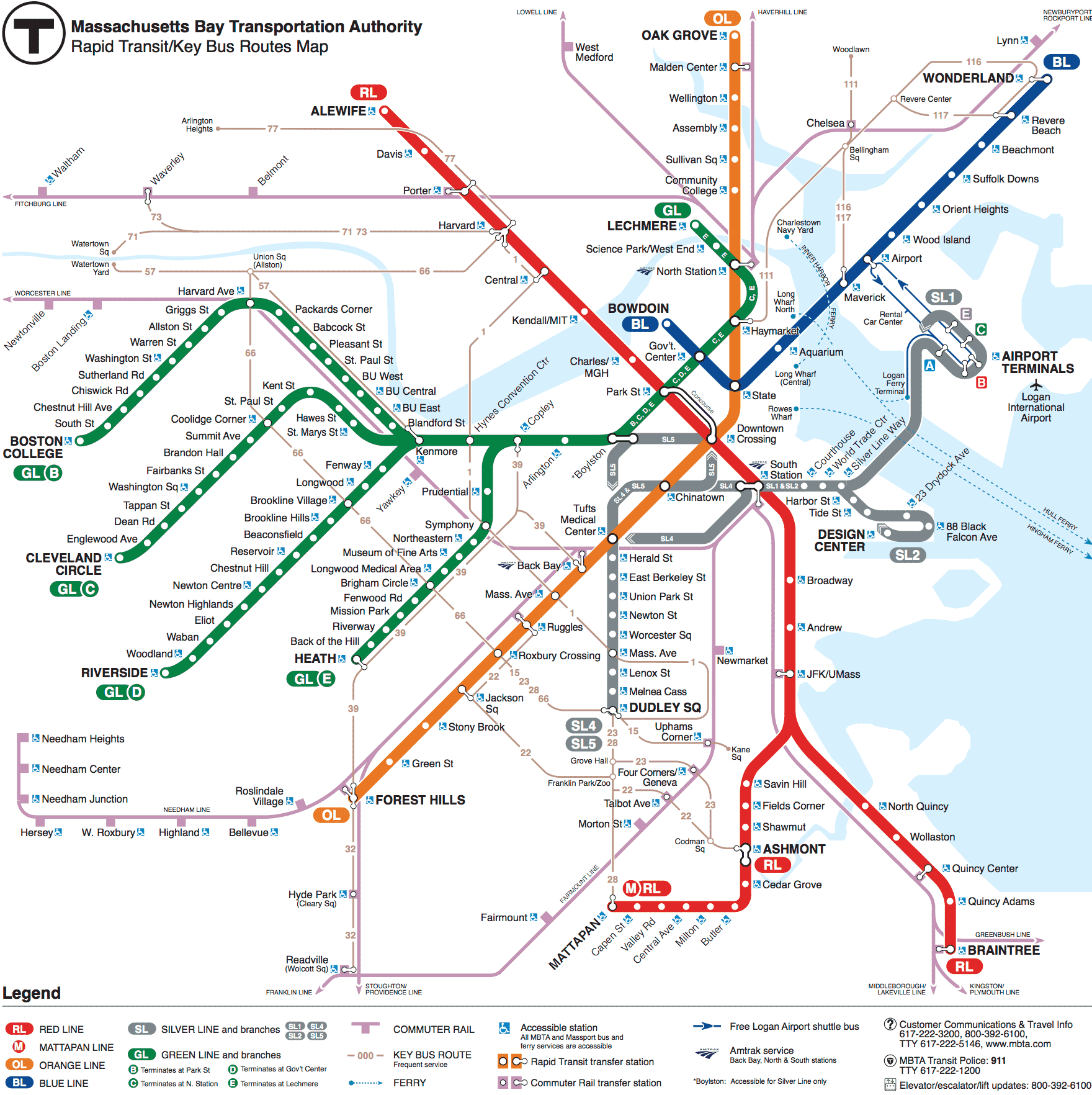
At around 8:00 pm, Ryan called regarding another potential idea, styling our map around the MBTA subway map but showing instead the walking distance between buildings around campus. Immediately I looked for various references on the subway map theme, such as the MBTA map itself, New York’s subway map, and London’s Tube map.
MBTA SUBWAY MAP
NEW YORK MAP 1

NEW YORK SUBWAY MAP 2
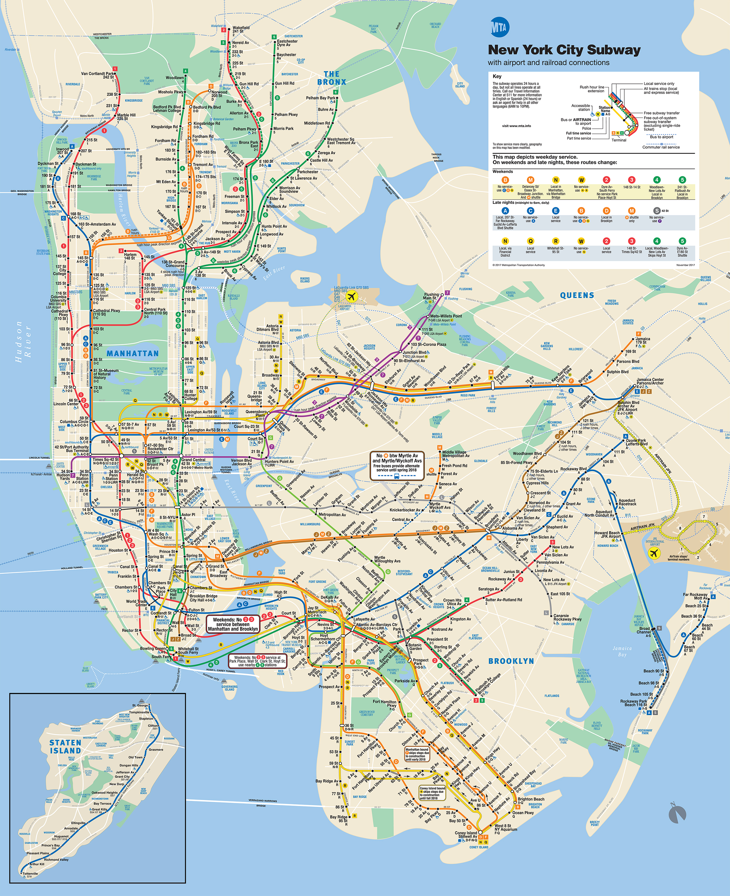
I was fascinated by the two different styles of the New York subway map, with 1 being more geometric design versus 2 being more spatially accurate design.
LONDON

Eventually we decided to go with a map design based on the number of steps it takes to get from the Campus Center to anywhere else. We thought it would be relatively easy to gather data by walking between the buildings around campus. Using a Fitbit to count the steps makes that significantly easier as we just have to record the starting and ending step count and input them into Excel to calculate all of the delta values. However, the snowstorm on Saturday significantly disrupted our plans, and we were forced to postpone our planned data collection meeting until Sunday.
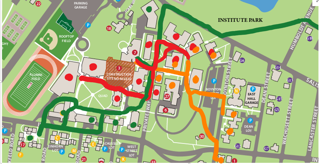
In the meantime, however, we decided to continue refining the idea and make an outline of what we imagined our map to look like. Starting off with a published map of the WPI campus, we annotated possible main routes based on what we felt were most traveled by students, trying to figure out the best way to connect them.
The subway map style can be a bit restricting because people don’t generally walk the exact same path and instead almost always take the shortest path. This becomes a problem when two buildings are next to one another yet people take different paths to get there. To illustrate an example, we looked at Daniels and Riley, which are quite close. However, when walking from the Campus Center to Daniels, students generally go around Bartlett towards the Quad. When walking to Riley, they generally go in front of Bartlett. This is not how a subway would be built; if this were a real subway, one line would be built that passes both Riley and Daniels and to go to either, the path would be slightly longer. As a result, after much debate on the extent to which we would follow the style, we decided to take some liberties and not necessarily follow it to the T :)!
Our idea of using a subway map to represent walking distance was already a slight departure from the style, because distance is generally not to scale on the subway map. This made deviating from the style a bit easier, but we still debated the extent for hours.
In order to best represent the walking distance, we thought of making the distance between the dots to scale and potentially including the number of steps between each building or the total number of steps from the Campus Center. We decided that we would go with a relatively geometric design (in keeping with the style) but maintain a spatially accurate scale that would convey the steps it would take to walk. We decided to table the issue of whether or not to include the number of steps and figure that out later.
Maiya J. Mitchell
I agree with Greta in your previous! I really appreciate the thought of using a subway map to help students get around WPI efficiently.
I cannot believe you actually counted your steps to get around places. That is some dedication! I do not think that is necessary. I think it would be easier and more effective if you just timed how long it take for you to get somewhere. Besides, people are different heights and have different strides, so this may not apply to someone who is really short or really tall.
I wish you would post what your map looks like now. I can only recall vaguely what I saw on Monday. But from what I can remember I enjoyed seeing WPI from a different perspective. I
admin
Thanks! As a clarification, we didn’t end up walking all of the paths. On Sunday when Ryan and I were planning on walking, I thought on my way to the Campus Center I would collect data. Once we actually started talking and figuring out the next steps, we ended up scrapping all of that and settled on measuring it in Google Maps instead (much easier for sure!). The fact that other people’s strides are slightly different would possibly be alleviated by just using an average stride length and measuring, since we’re now using distance instead of actual footsteps.