I used to have a Wacom tablet but it broke (include picture here) the engineer in me wanted to take the pen apart…
I rented one from the ATC for a couple of days

I used to have a Wacom tablet but it broke (include picture here) the engineer in me wanted to take the pen apart…
I rented one from the ATC for a couple of days
Powered by WordPress & Theme by Anders Norén
Ryan Cudemus-Brunoli
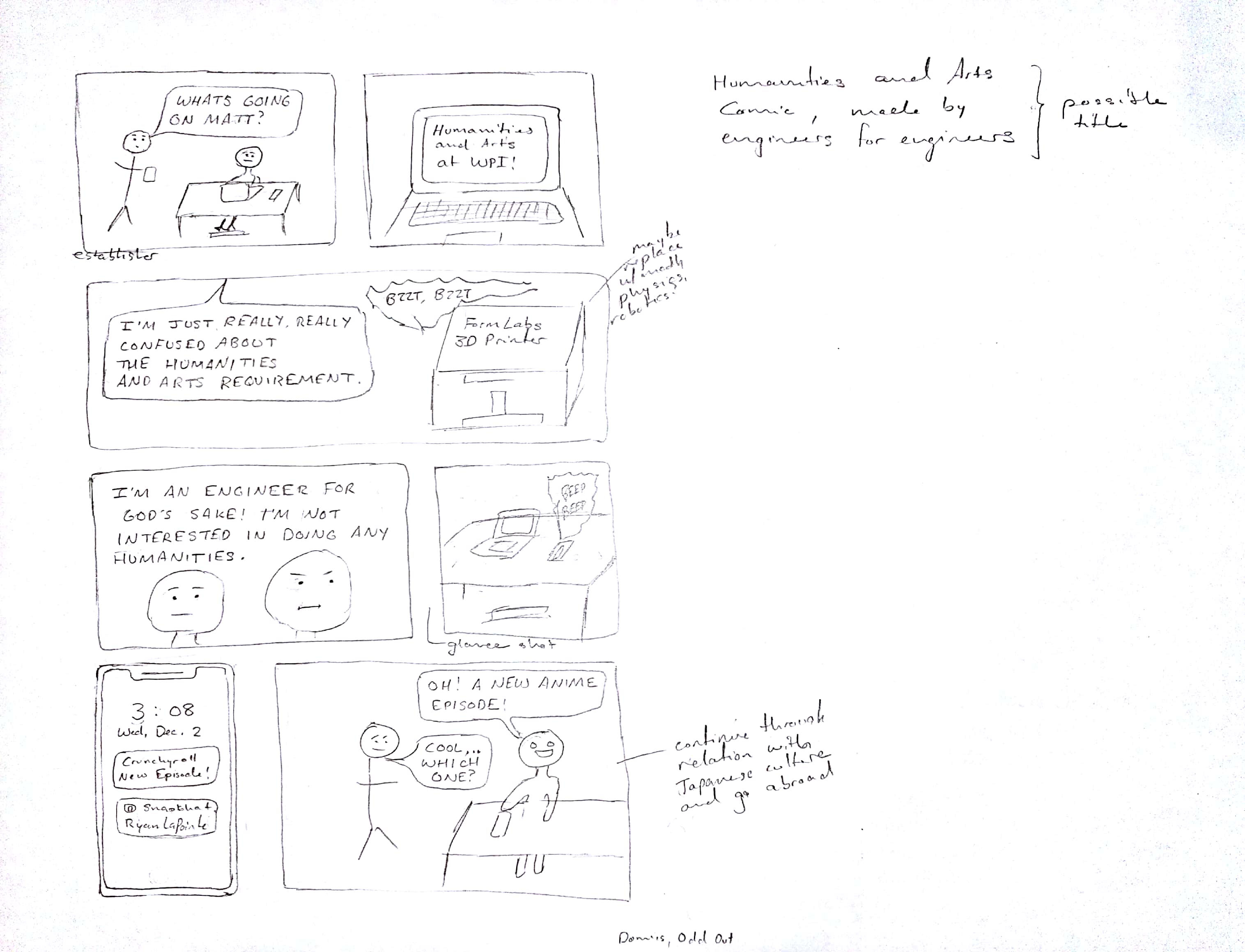
I think I see the direction that you’re taking with this comic, and I definitely like it. I’m guessing (hopefully correctly) that you’re going to go into spiel about how anime is a form of art that you can tie back to Humanities and Arts?
Speculation aside, I’m a fan of the engineer’s stance that he doesn’t need to do anything regarding humanities to be a good engineer, and I hope you go on to prove that stance wrong.
Your detachment of certain objects into their own panels without any human actors is also interesting, as it attracts interest to things that are “interrupting” the scene and moving the plot along. On a quick artistic note, the stick figure person in the same panel as the person at the computer desk (very last panel) is a bit jarring in terms of comparison.
Greta S. Jarvi
Your possible title is really creative, and I think you should keep it. I like the title because it reminds me a lot of titles of books one would see in a store like Urban Outfitters or Barnes and Noble that are marketed to millenials. Your title instantly creates shared character between the audience and the creators because it suggests they are the same kind of people; engineers. In the draft, the text is a little difficult to read. Typing the text might make it clearer for the audience to read.
I’m not quite sure how the rest of the comic will explain the humanities approach, but you are probably incorporating that in you next drafts. Your comic connects to its audience, more than other comics, to the life of a college student in the way you use the phone and even in the conversation between the two students. Continuing to implement these relatable aspects will make your comic very appealing to first year WPI students.
Ryan Cudemus-Brunoli
Briefly, to agree with Maiya, your storytelling at its core is very relatable and I think it’s going to be a strong story. But, the difference between the stick-figure and gingerbread man is pretty jarring, and standardizing your writing would be super useful. For my comic, to keep the lettering similar, I used some standardized lines going across the page to keep my own handwriting in check.
Cheers!
Excited to see what y’all do for a final product!