
The final design is almost complete! Our group met up on Saturday to complete the information graphic itself and work on the artist statement describing what the graphic means, what it is meant to do, and how it is meant to do that.
EDIT: The final information graphic was originally due on 11/20/2017, however, the entire class has been given an extension to 11/27/2017.
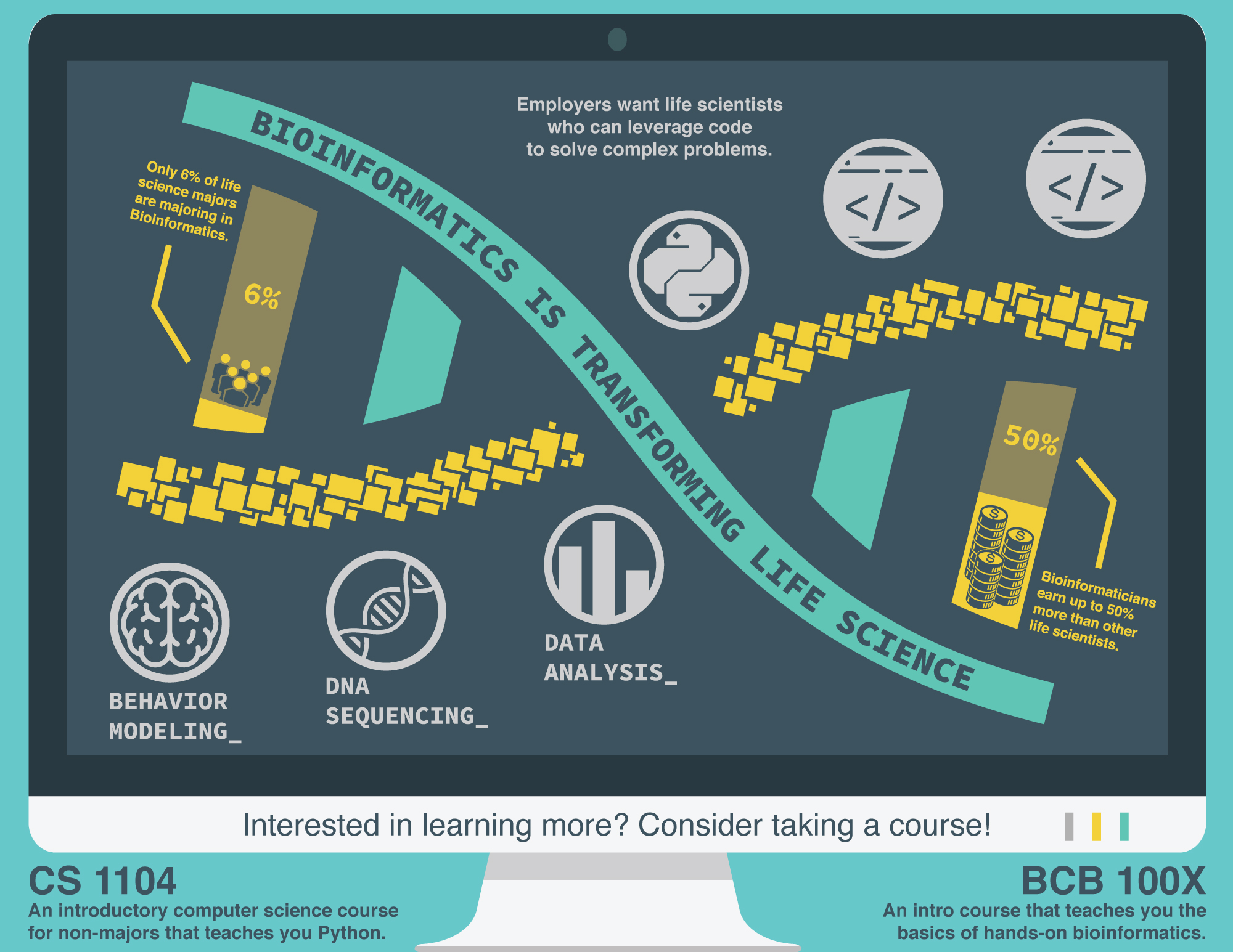
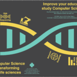
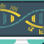
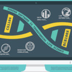
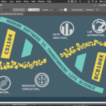
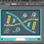
The purpose of this information graphic is to show life science students at WPI how bioinformatics and software impact biology in order to persuade them to take the CS1104 and BCB100X courses. To accomplish this, we made the central focus of the graphic a DNA helix, a choice which served both symbolic and logical purposes. DNA symbolizes biology through its fundamental association with the life sciences. Its structure consists of two intertwined strands connected by base pairs; one strand has a teal color representative of science and biology, while the other has a pixelated, digital motif which evokes the notion of computer science. These connotations, combined with the linked nature of DNA, convey the idea that computer science and biology are fundamentally intertwined. The base pairs connecting the two strands further imply a strong link between the disciplines, while providing statistics to enhance the message. The statistics point to the lack of interest in bioinformatics within the life sciences, and the financial benefits to pursuing it as a career. In addition to this data, each of the three lower icons show concrete examples of problems in biology that computer science can solve, thus providing a logical basis for taking a computer science and bioinformatics course. The entire diagram has been tilted to help guide the eye naturally along the DNA, and icons have been positioned around the molecule to provide peripheral information to the viewer as they read the headline.
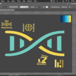
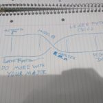
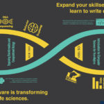
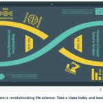
I have included a gallery of the progression of our drafts:

Ryan Cudemus-Brunoli
I love your overarching design and motifs, and I think your most recent draft is a lot cleaner and uses the space effectively. Although, I still think there is a minor issue with how your poster is displaying your purpose, you specifically state that you want to persuade life science majors to take some CS or BCB courses, but what I am getting from it is that CS and BCB impact life sciences, which is perfect and fits the first half of your purpose, but the convincing aspect is gone. Your previous iterations included statistics that could help convince and even had a blurb about how people should consider taking one of the courses, the most recent draft, to me, lacks that persuasion.
Maiya J. Mitchell
I love this design. It looks wicked professional and serves its purpose of giving out information creatively, but I agree with Ryan that it isn’t necessarily appealing from a rhetorical standpoint. I believe Prof. deWinter said something about this as well, but what I immediately noticed was the color scheme. The scheme that you used is traditionally viewed as masculine. Even though this view is somewhat biased by our society, I again wouldn’t use this color scheme for a baby girl’s baby shower. That being said I think that your audience is indirectly directed at just males. I definitely think doing a little more research of what would be appealing to both women and men will help you resolve this problem. Also, including the Python logo with a label and simple things like that could enhance your display.
admin
Thanks for the comment! We definitely debated whether or not to change the color scheme after getting the feedback in class. Originally we didn’t realize at all that it would be considered too masculine, as our audience was just general biology students assuming that they were generally like us (i.e. male). Knowing now that the majority of life science majors at WPI made the debate for the color scheme difficult because we couldn’t find any particular colors that would fit the theme and still be considered “feminine.” We initially chose the teal colors because of the concept of “bio green,” that most people associate greenish colors with the life sciences. Even in Goddard Hall, each of the floors is a different color, with the chemistry floor being blue, the biology floor green, and the bioengineering floor being yellow.
Maiya J. Mitchell
Someone in class commented on how your helix could be made completely horizontal to make the graphic symmetrical and make it easier to add female-friendly information in the blank space where the bonded base pairs would be. I do not agree with this only because this graphic has so much to offer and even though it isn’t necessarily appealing to everyone, it caught my attention quite quickly and I have no interest in bioinformatics at all. Keeping the double helix slanted, in my opinion, is a risky but beneficial and adds character.
Ryan Cudemus-Brunoli
Sorry to keep commenting, and this might be a bit nit picky, but the two blurbs that you put in the bottom left and bottom right are difficult to read, even when I’m on my laptop and can zoom, something to think about. Maybe try using a font that is more legible at a distance? Other than that I really like the graphic and how it has turned out. In another legibility term, your off-white on the blue background is great for reading.
admin
Yeah definitely! I agree that they seem to be a bit hard to read on screen but when printed it should be a bit more clear. We had some trouble, though, figuring out where to place the two blurbs about the classes. We didn’t want them to interrupt the flow of the graphic by placing them inside the monitor itself, but at the same time placing it outside makes it seem less relevant and not part of the main graphic. We ended up leaving it there because there wasn’t really any good alternative. In our original, we had the two classes as part of the base pairs, but it had to be removed to make space for the statistics.