
Our final draft of the WPI Walkability Map is complete!
Our artist statement is as follows:
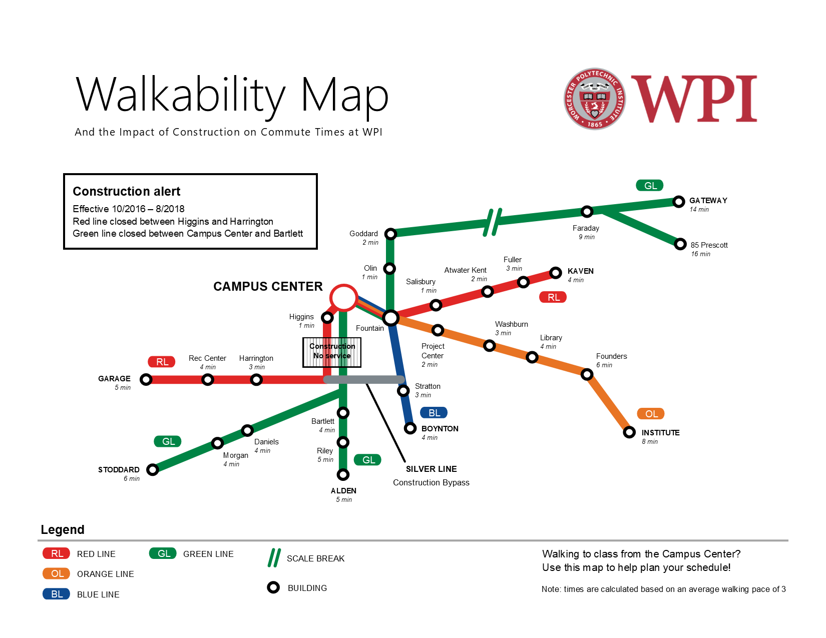
The purpose of our subway-themed walkability map is to show students in the Campus Center the time it takes to walk to various buildings around campus in order to help them plan their schedule and show the severe impact of the construction site and the delays it causes between certain parts of campus. The intended audience of our map is WPI community members in the Campus Center, and we plan on having the map printed at poster size and hung on a wall or near the door. To accomplish our goal, we designed our map to have some of the same visual characteristics as the subway style of the MBTA rapid transit map. We intended that these deliberate design choices would subconsciously make the map familiar to those from around the Boston area and assert its authority by making it seem as if it were an official document. We styled the color choice to match that of the MBTA, the font used for the labels, as well as the style of the legend. The deliberate similarities also extend to the way the names of the last stop are written in all caps and bold, the labeling of the individual lines, as well as the nomenclature of the lines themselves as colors (i.e. green line, red line, etc.). The silver color of the “construction bypass” line on our map is a subtle reference to Boston’s silver line, which—deceptively—is a bus rather than a train, and as such is slow. A person familiar with Boston’s rapid transit system will get this insider joke and identify more closely with the map. While these stylistic elements will be effective with audience members from this area, others appeal to a broader audience. We decided to have the Campus Center be the central point of our map from which walking times are measured. Because the construction site is directly next to the campus center, and in order to get from the Campus Center to the quad students now have to walk completely around Higgins, the impact of the construction is greatest there. The organization of the lines and stops is done so that more “train transfers” are required to get between certain buildings with the construction site present than without it, which emphasizes the impact. The map style is rhetorically effective because it condenses the pertinent information and presents it in a simple and clean look. There are often significant amounts of unnecessary details in geographic maps, which end up distracting the end user that simply wants to know how to get from one point to another. The subway style helps distill the information and presents only the most important and useful information specifically for transit. However, the style does have some limitations due to its simplicity and geometric look. This map is not intended for giving directions but rather for schedule planning for trips starting from the Campus Center.