I realized that although the comic needs to be polished up, I wanted to work on redoing the typeface project so that it could be more useful as an actual typeface and hopefully be used.
I decided to also work on my font and bring it into better shape. I thought that using the hand drawn approach really adds character to the font and helps convey the vision of a scary Yeti being around the corner and the cold temperatures. However, hand drawing all of the letters with pencil, as we did, made the font be an outline instead of completely filled. We didn’t have much time to fix that during the font unit, so I thought it would be great to go back and really make the font a complete and polished typeface. Also, the outline occasionally had slight breaks in it due to the variations in stroke that the scanned pencil lines had. In addition to filling in all of the letters, I decided to give the font a more cohesive look by redoing the entire second half of the alphabet according to the same style that I drew the first half in. I also wanted to add some more punctuation marks so that the font would be more usable, such as a question mark and a comma. Although I think adding the lowercase glyphs would be interesting, I think it is outside of the scope of this project. Instead, I decided to make the entire font be in capital case by replacing all of the lowercase glyphs with the uppercase glyphs, so that no matter how you type, whether it is in a lowercase or using caps-lock, the letters always appear and they appear to be capitalized. That was one problem with the previous draft, because if someone typed in lowercase, the glyphs would be replaced with standard glyphs or with an unknown character mark. Some fonts already do this same thing where no matter which case you type in the letters are capitalized. For example, Algerian and Castellar do this.
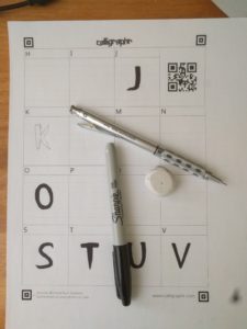
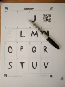
In order to create the filled letters, I used a sharpie instead of a pencil, and made sure to fill in any areas with ink instead of leaving them empty. This also made the letters much darker and thus easier to scan in. I used Calligraphr again to turn the scans into an actual font and downloaded the OTF file from there. I honestly thought it would automatically fill everything in to make the final letterforms, but instead it used the scans as is. I used their template called “Minimal English” which contained the most frequently used characters, including punctuation such as a colon, comma, and quotation marks. However, to make sure that I didn’t make any mistakes, I first drew the glyphs in with a pencil and went over it with sharpie.
As much as I wanted to reuse the glyphs I had already drawn, the first half of the alphabet and the punctuation in the previous draft, I decided to redraw all of them which took significantly more time. However, this made sure that the entire font was cohesive and fit the same style rather than having a clear split in the middle of two slightly different ideas.
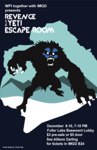
I want to reiterate the intended purpose of the typeface. It was designed for an escape room held at WPI, themed around an “Escape from the Yeti” during an expedition to Mount Everest. Some of the terms we were given to research are listed below. Because my second draft font still has the same general stylistic elements as the previous, I used the same inspiration images to help bring the style to life.
- Everest expedition
- Sherpas
- Cold
- Tents
- Oxygen
- Yeti
As previously I wanted to keep the font in a geometric style so that it can also be used outside the scope of this project and in other cases.
I decided to rename the font from “Ice Pick” to “Frigid,” which I thought better represented my intentions with the typefaces and also served to broaden the potential usability of the font. Instead of focusing on the Yeti aspect of the design, I decided to focus more on the cold, frigid, part. This decision made the entire project more challenging because representing these concepts with simple geometric shapes is much more difficult than if I were to use a more literal typeface, such as by sweeping the letterform in Photoshop or in Gimp to have an icy look.
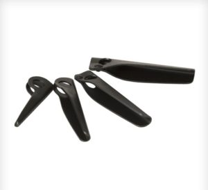
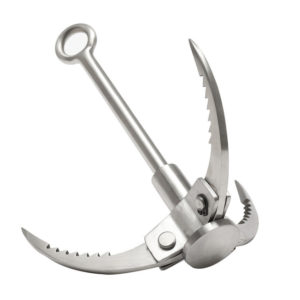
The period and point of the exclamation mark were intended to resemble an ice cube, as well as the period and comma. However, the comma and semicolon were intended to resemble the teeth of the Yeti. The question mark was styled to look like a grappling hook that a mountain climber might use. However, the P was designed to be almost exactly the same shape as a piton, a metal spike that is driven into the rock or ice to make a hook that they can attach their safety gear to.
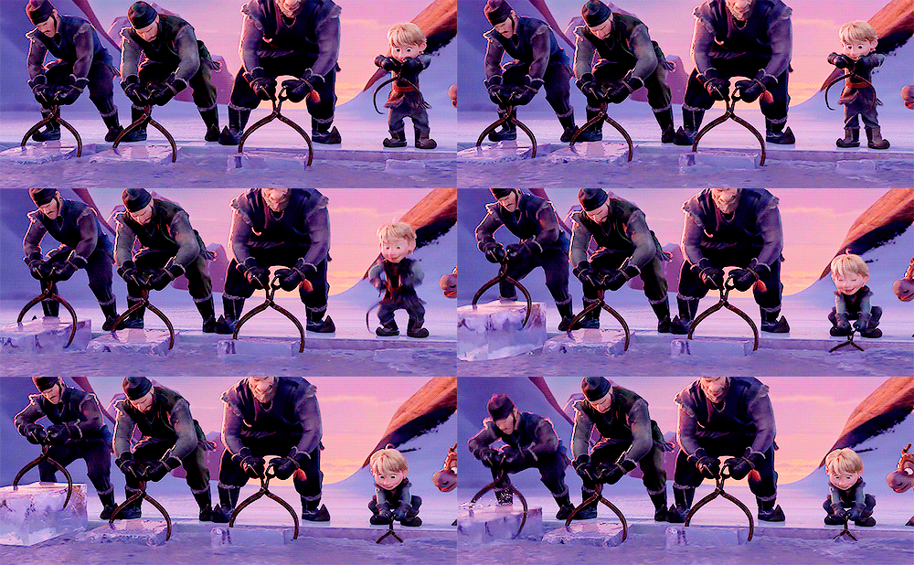
By using the serifs around the C, the letterform was intended to resemble the tool that ice harvesters would use to grab ice out of the water.
Although I wanted to add some more elements of the Yeti to the O, I decided against it so that the font would be more usable in different cases. The Q resembles the O as if someone drove an icicle through it.
I decided against using a vector based typeface designing program such as Type Light or Illustrator because I felt that I would lose the essence of the font. Hand drawing the letterform gives a character to the typeface that is almost impossible to achieve with digital programs despite the numerous advantages that they do provide. Before uploading my scans to Calligraphr, I modified and fixed up certain elements that I had messed up slightly or wanted to be more refined in Gimp.
