
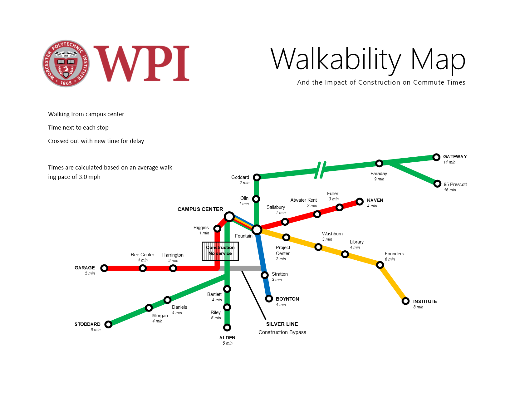
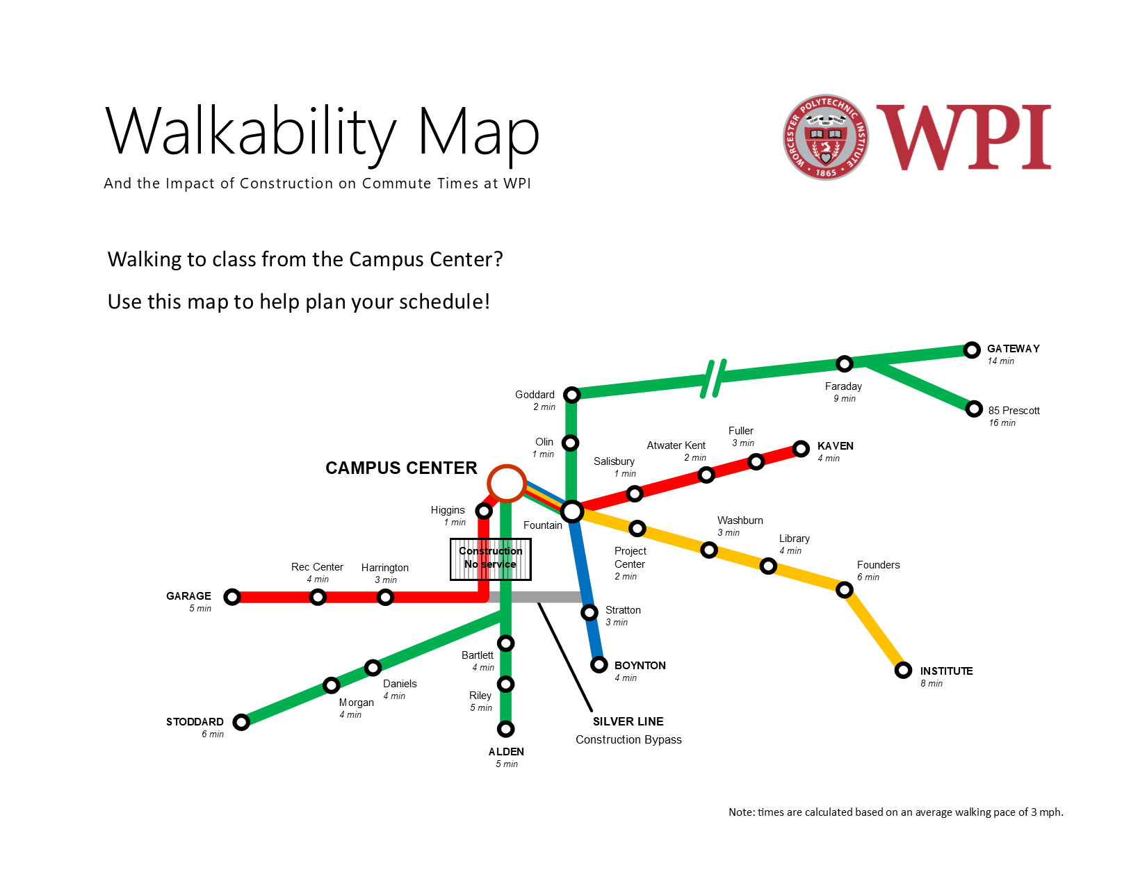
In order to make our purpose clearer, we got advice from Professor deWinter. She made a number of suggestions using her trademark sharpie method – drawing all over a printed copy! This time before presenting it to her, I made sure to include the actual times in minutes which is hopefully much more relevant than distance or steps needed. This took a lot of time to get finished because we needed to calculate the times from each station based on an average walking pace of 3 miles per hour. However, the most challenging part was actually making sure everything was lined up and that the times were all italicized and in smaller font – just a lot of manual labor!
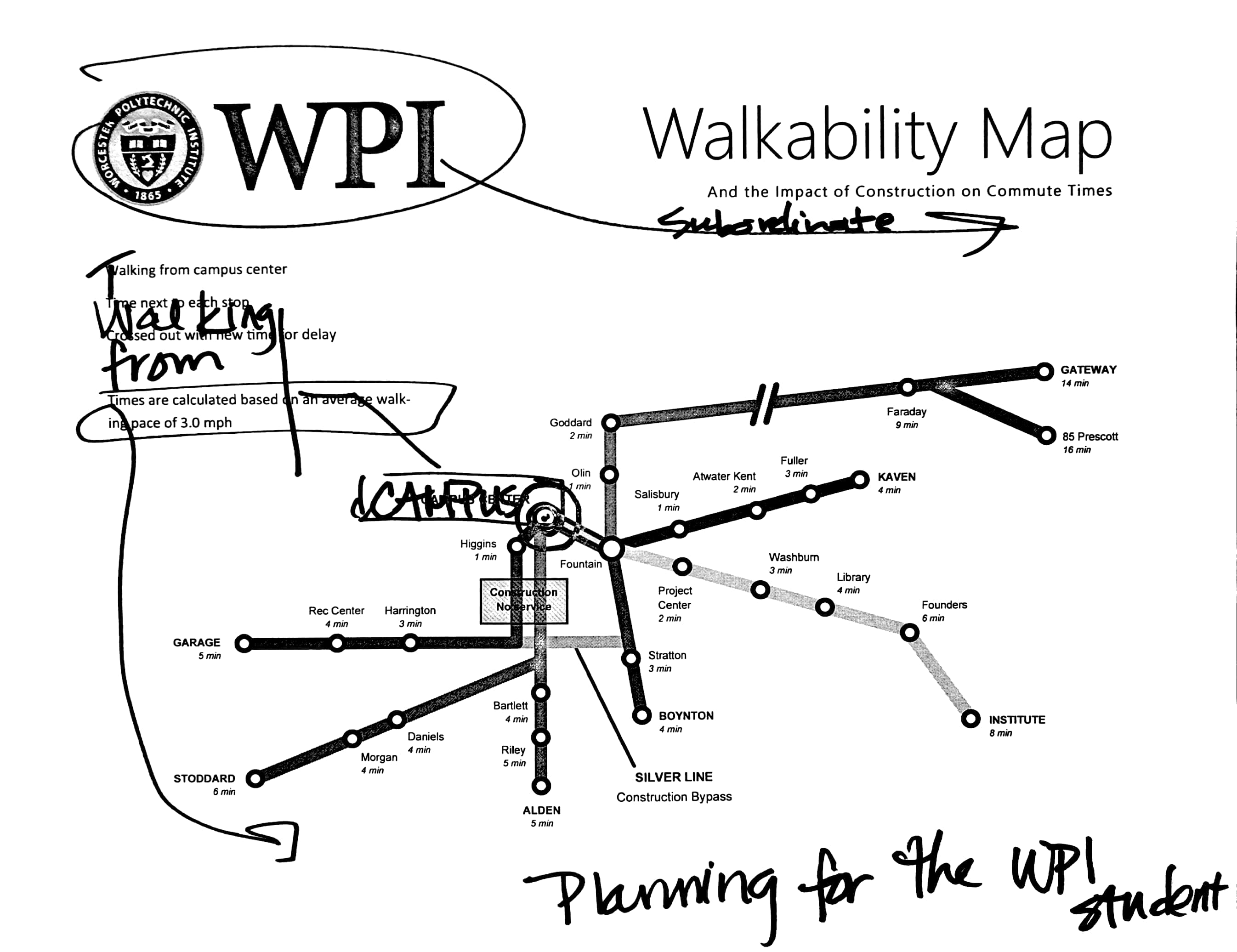
Based on her advice we made a number of changes, as shown below.
At the same time as the map unit we were assigned a final project. However, I just haven’t had much time to muse over what I wanted to do until now. For the final project, I decided to revise and add to the previous comic project and bring it to a more final and “publishable” document. I really like Greta and Ben’s idea of having a fillable worksheet at the end so that the reader can apply the comic story to their own college plan. I thought that it would be really nice to add something like that to our comic so that it could potentially be used at New Student Orientation or as handout material during the humanities requirement presentations. Professor deWinter also mentioned to use Illustrator to convert the hand drawn files to vector graphics, exactly as Caroline and Katie had done with their drawing of Gompei the goat!
As an additional side note, I have commented significantly outside of my blog group. Also, I love Brandon‘s blog style which continues to inspire me to do better documentation on my own site!
Ryan Cudemus-Brunoli
I’m a fan of Professor deWinter’s moving the WPI logo to the top right so that you read “Walkability Map” before WPI. Although, if this was vetted through WPI administration, I think they’d prefer the WPI to be top left haha, but for the purpose of the map, deWinter’s suggestion is best. I struggled with spacing and text placement in my own map, and where someone’s eyes may be drawn to first. I made sure that with every first line of every minor textual statement I made in my map, the reader wouldn’t find any possible negative connotations about Worcester.
I think your map design is quite novel, and I have never imagined turning WPI walkways into a subway-style map, and I REALLY like it. Your inclusion of walk times is also very cool too, as well as relevant stops. Great job!