Society both craves instant gratification, and antagonizes melancholy. Consequently, laziness and procrastination are abundant, like an eerily quiet disease that disguises itself with symptoms of happiness and joy. Thus how wise it is, to be the destroyer of such a disease. Unfortunately, in modern society, the purveyor of the disease is, none other than the media. I was recently rereading Fahrenheit 451, and noticed that Bradbury also states that “Not everyone is born free and equal, as the Constitution says, but everyone is made equal.” There are clearly multiple analogies with modern society. However, the conflict is that the media is not purely a bad thing. In fact, books are essential to Montag, the main character, because they give to him the truth in its bare form, emanating the history which happened so long ago, not what the propaganda the government or other institution wants. Expressive, unadulterated media is an essential component of a free society. Media today, however, is a means of further tightening the grip of the powerful on society. Without reading a real history book, not a simplified digest of information that the government provides. Yet in society, do these truths really matter? The cognition of these facts have no importance to a great society, as the average man simply does not care. Bradbury famously said, “‘The zipper displaces the button and a man lacks just that much time to think while dressing at dawn, a philosophical hour, and thus a melancholy hour…. Bigger the population, the more minorities. Don’t step on the toes of the dog lovers, the cat lovers, doctors, lawyers, merchants, [etc.] … There was no dictum [to stop writing], no declaration, no censorship, to start with, no! Technology, mass exploitation, and minority pressure carried the trick, thank God. Today, thanks to them, you can stay happy all the time, you are allowed to read comics, the good old confessions, or trade journals.’ … ‘With school turning out more runners, jumpers, racers, tinkerers, grabbers, snatchers, fliers, and swimmers, instead of examiners, critics, knowers, and imaginative creators, the word ‘intellectual,’ of course, became the swear word it deserved to be…. [By limiting books,] Each man the image of every other; then all are happy, for there are no mountains to make them cower, to judge themselves against…. People want to be happy, isn’t that right? Haven’t you heard it all your life? I want to be happy, people say. Well, aren’t they? Don’t we keep them moving, don’t we give them fun? That’s all we live for, isn’t it? For pleasure, for titillation? And you must admit our culture provides plenty of these.’” This specific passage so enthralled me because it nearly perfectly aligns with our society and culture here in America today. The fact that Bradbury wrote this sixty-three years ago (in 1953 when Fahrenheit 451 was published) highlights his genius. The book is an incredible piece, and is eerily accurate with its predictions of what modern society would look like.
What greater pain is there but for the wonderous thoughts that so wander about to flutter into oblivion the very moment they are conjured?
Our greatest gift is our sauntering imaginations, and for such a beautiful thing to go to waste is a distressing notion, in my mind and in other minds alike. To spew thoughts onto the page without regard to the meaning, but as a stream of consciousness, is an incredible freedom not often appreciated enough.
A creative is able to conjure up fictional worlds in such a manner that they often become tangible, alive even, within the mind of the beholder. However, because the memory of the human mind is feeble, the incredible fantasies vanish into thin air just as quickly as they arise.
Writing is the only solution therefore, as we have yet to discover a device that can record thoughts directly in some way that is understandable to mere mortals. The chief complaint regarding writing, is the sheer difficulty of simply beginning. After all, to move such a heavy mass as the imagination requires significant energy and effort.
I used to be in the same boat. A significant amount of time has passed since the beginning of my own journey through my conscience, though now more remains to be explored than when I first made headway. With each passing moment, I am more satisfied by the new questions that arise from the old. This is the great joy in life: learning more and more about the universe, yet realizing how much more there is to know. With every question that is answered, there are easily ten more that arise.
Therefore knowledge is not a linear progression, but rather, exponential. As more is discovered and as more is understood, the imagination is let loose on a larger field and is free to wander through an ever growing universe. The mind can saunter along at its own leisure, finding new paths and reminiscing on old memories. Please, for the love of all humanity, set your life free and explore every inch of your own mind. What happens is relief from having to remember all of the great thoughts that you once had.
Note: This article was originally published as part of the Q3 2019 issue of the WFCC Newsletter and is reproduced here with permission. See original: http://www.sahilnawab.com/wfcc/q3_2019.pdf
Dealing with stress is an integral part of the modern human experience. We all struggle with health-related issues, financial difficulties, family disagreements, and many others. There are a number of negative effects associated with high levels of stress, from headaches and depression to even physical health issues and increased recovery times. Therefore, it is crucial to have healthy and productive coping mechanisms to manage our stress.
In a brilliant TED Ed video, Massimo Pigliucci discusses the Stoic philosophy and its origins in the teachings of Zeno of Cyprus when he became shipwrecked off the coast of Athens and lost all of his wealth and possessions.
While today the term stoic has developed its own meaning as an adjective to describe someone who endures difficulties while remaining calm and collected or someone who rarely shows emotion in the face of adversity. However, the original philosophy goes much deeper, and is in fact much more applicable in our daily lives to help recognize and handle stress.
“While we may not always have control over the events affecting us, we can have control over how we approach things.”
This statement concisely summarizes the Stoic philosophy. But while this captures the essence of Stoicism, how can we actually apply it to our lives?
Pigliucci describes the four core tenets of Stoicism that we can follow:
- Practical wisdom — the ability to navigate complex situations in a logical, informed, and calm manner;
- Temperance — the exercise of self-restraint and moderation in all aspects of life;
- Justice — treating others with fairness even when they have done wrong; and
- Courage — not just in extraordinary circumstances, but in facing daily challenges with clarity and integrity.
Often people conflate Stoicism with having a nonchalant attitude towards life. However, that’s an incorrect characterization. Stoicism is not about discounting or not caring about issues, but rather it is about understanding that these issues should not cause unhealthy levels of stress. Rather, we should focus our efforts on matters which we can actually address.
In fact, a nonchalant attitude can be quite counterproductive. Stress is an effective motivator for action. Modern psychologists describe this through the stress-productivity curve, or more formally known as the Yerkes-Dodson Law.

Fig. 1 – Stress vs. performance curve, adapted from the Yerkes-Dodson Law (Image: Heath, 2019) (PS. I first saw an image like this in a class presentation HU3900_D2019, but since have not been able to find the original source. I searched for a similar image, and found this here: https://slideplayer.com/slide/16338179/)
Perhaps this response arises from evolutionary pressure. Stress may have been an action-motivator to our evolutionary ancestors. During primitive life, actions were likely conducted over much larger timescales, especially given the exponential increase in pace in our modern lives. Consequently, stress arising from situations such as limited food availability or lack of social contact, may have pushed early humans to act, potentially providing an evolutionary advantage to a stress response.
Therefore, in a well-managed manner, stress provides an excellent way to push ourselves to do better — just the right amount can make us more productive and compel ourselves to address the challenges that we face.
First, know and recognize stressors before they become stressful. If you can recognize that certain matters are out of your control, you can begin to address those that are /in/ your control. That is the first step in being able to act calmly to actually address those factors and reduce the stress.
By incorporating elements of Stoicism into your own personal philosophy, you can become self aware and more conscious of how external events affect your emotions and mental state. It then becomes much easier to deal with those changes and develop healthier stress coping mechanisms. Let me end with an interesting thought to ponder: “Suffering stems not from the events in our lives, but from our judgements about them.” — Epictetus
Dossier
“The Philosophy of Stoicism,” by Massimo Pigliucci, June 19, 2017. https://ed.ted.com/lessons/the-philosophy-of-stoicism-massimo-pigliucci. This is an animated video lesson explaining the history and general philosophy of Stoicism in an entertaining story format.
“Are You Too Stressed to Be Productive? Or Not Stressed Enough?” By Francesca Gino, April 14, 2016. https://hbr.org/2016/04/are-you-too-stressed-to-be-productive-or-not-stressed-enough. This is an article from the Harvard Business Review that provides some practical advice to improve your performance from related stress.
As much as medicine desires to be a purely objective science, it is still mired in ethical controversy as a consequence of its human element. Often, medical decisions are not always made through logical reasoning, but rather include social, emotional, and economical components, among others. However, what ties together these alternate components is the rhetorical discourse between the patient and physician, patient and family, and more generally, the patient and society at large.
In order to effectively work within this rhetorical environment, physicians should realize that medicine inherently lies at the intersection of art and science. In some ways, it is the perfect blend of creativity, technique, empathy, emotion, technology, and evidence-driven science. However, medicine remains first and foremost an applied science, and therefore it must contend with the divergent goals of not only serving the needs of the patient but also furthering the scientific study of the human body. Whether or not medicine is able to reconcile these discordant ambitions is a complex issue. However, the conflict is particularly evident in end of life care. Medicine has continuously struggled to answer the question: at what point do physicians, or the patients for that matter, decide that enough is enough? When is intensive medical care considered to too costly (both in terms of the wellbeing of the patient, as well as more recently the monetary expense)? This questions is often posed to patients and physicians alike during difficult times, for example, when patients are facing a terminal illness, or are unresponsive and on the brink of death. What role does medicine play, or rather what role should it play when there is nothing more that can be done? What role should medicine play when what can be done in fact causes more harm?
The answer to this question has changed drastically within the last two decades during which the pace of advancement has exponentially increased. Some might even argue that medicine has advanced past the point of “naturality,” or in other words, to the point of being able to artificially support life for longer than considered natural. At the same time, the majority of Americans have expressed the desire for a peaceful death, free of pain and unnecessary intensive care. As the aggregation of discourses surrounding this topic has evolved, public policy has adapted to reflect that desire, with the establishment of advanced directives and the “Do Not Resuscitate” order. Although beneficial in reducing unwanted intensive care, this idea has had its share of controversy, particularly when a patient reverses their decision when faced with death and decides that they do, in fact, wish to be resuscitated at the last minute.
As a result, effective communication of the patient’s end-of-life desires are critical. This communication issue is exacerbated when the patient is not able to express their wishes directly, and this has real life ramifications. Emergency physicians were confronted with a difficult dilemma when an unresponsive and deteriorating 70 year old male patient was brought to the emergency department. He had a tattoo on his chest with the words “Do Not Resuscitate” in bold lettering, followed by a signature, as shown in Figure 1. This situation, although ostensibly a medical ethics issue, is in fact inherently rhetorical in nature.
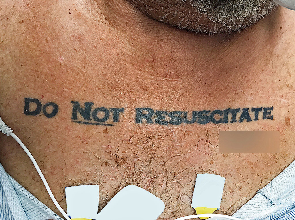
Fig. 1 – Photograph of patient’s “Do Not Resuscitate” tattoo on the chest (Image: Holt, NEJM)
The attending physicians struggled to make a decision in discerning whether or not the tattoo was an accurate representation of the patient’s wishes and whether or not it was legally valid without the presence of an official state-sponsored document. Eventually the physicians decided to not honor the tattoo, “invoking the principle of not choosing an irreversible path when faced with uncertainty” (Holt, 2017). This is the aggregation of discourses at act; the medical field has decided that life saving interventions is the default mode of action. In essence, the discourses contend that life is too precious to lose, almost regardless of cost, even if the cost is to the patients themselves. The question becomes, does the tattoo represent the true desires of the patient, or is it a regrettable attempt at morbid humor? If the patient were conscious, would he request doctors to ignore the tattoo?
Rhetorically, tattoos hold little significance in comparison to other forms of communication. However, this begs the question, why would doctors choose to ignore the tattoo? Why is the tattoo considered an inadequate form of communication? The general negative stigma surrounding tattoos is likely a significant contributor. Some tattoos serve as permanent reminders of a regrettable decisions while a person was intoxicated. The possibility that the patient did not intend the tattoo to be taken seriously forced the physicians to err on the side of caution. Despite this, the attending physicians remarked that “this decision left us conflicted owing to the patient’s extraordinary effort to make his presumed advance directive known” (Holt, 2017). This conflict led to the physicians requesting an ethics consultation.
Following careful review the ethics committee advised the physicians to honor the wishes of the patient’s tattoo. They argued that “it was most reasonable to infer that the tattoo expressed an authentic preference, that what might be seen as caution could also be seen as standing on ceremony, and that the law is sometimes not nimble enough to support patient-centered care and respect for patients’ best interests” (Holt, 2017). The process of obtaining a D.N.R. order can be challenging and time-consuming, and therefore patients may eventually choose to take matters into their own hands.
Despite being given exactly the same data, i.e. a terminally ill and deteriorating patient with a “Do Not Resuscitate” tattoo, the physicians and ethics committee made differing claims. This is attributed to the different warrants used to justify the claims. Specifically, the physicians used their professional “gaze” in order to establish a warrant that they have a responsibility in prolonging life to the best of their ability, as well as the discourses within the physician community as justification. However, the warrant of the ethicists relies much more strongly upon the relatively new idea of patient-centered care with respect to end-of-life directives and the notion that medical intervention may not necessarily be in the best interest of the patient. Importantly, a warrant common to both the physicians and the ethicists is that the tattoo may not reflect the current desires of the patient, given its permanency in contrast with the much more malleable nature of human ideology.
Would the ethicists have made the same decision, however, had the patient not been in deteriorating condition? Would they have instead waited until the patient became conscious, albeit potentially in significant pain, to confirm their desires? This alludes to the fact that rhetoric is highly contextual; that is, contextual clues can often change the meaning and seriousness of the message. Just as human perception forces a reality to be constructed spontaneously “on the fly,” the rhetorical situation is itself built on that perception and is therefore processual as well. At each situation, the rhetorical perception is reconstructed based on the aggregation of discourses that existed prior, and most importantly, those discourses are constantly added to and modified as the environment changes. Thus the discourses are alway in flux, slowly adapting alongside society.
Currently, when an unresponsive patient presents with a life threatening illness, the general presumption—that is, the current aggregation of discourses in the medical field—is to care for the patient and prevent death to the best of medical practitioner’s ability. This is an aggregation of discourses that has roots in society’s fear of death. However, this discourse is slowly changing in response to the acute realization that death, and specifically a pain-free death, is not always unwelcome.
Of note is that, subsequent to the decision by the ethical committee, the social work department was able to identify the patient and obtain the patient’s official Florida DNR order, “which was consistent with the tattoo” (Holt, 2017). The patient continued to deteriorate and eventually passed away without further advanced airway management. The attending physicians note that they “were relieved to find his written DNR request, especially because a review of the literature identified an earlier case report of a person whose DNR tattoo did not reflect his current wishes” (Holt, 2017). This earlier case provides an antithesis to the argument that the tattoo accurately reflected the patient’s desire that his end-of-life wishes be conveyed appropriately and taken seriously.
A few years earlier, a 59 year old man with diabetes presented to the hospital with a “D.N.R.” tattoo on his chest, shown in Figure 2. However, this patient explained that though he did not want prolonged attempts at life saving care, “he indicated that he would want resuscitative efforts in the event of cardiac or respiratory arrest” (Cooper, 2012). The patient later explained to physicians that he had lost a bet and consequently had to tattoo “D.N.R” on his chest. “He stated that he did not think anyone would take his tattoo seriously and declined tattoo removal” (Cooper 2012).
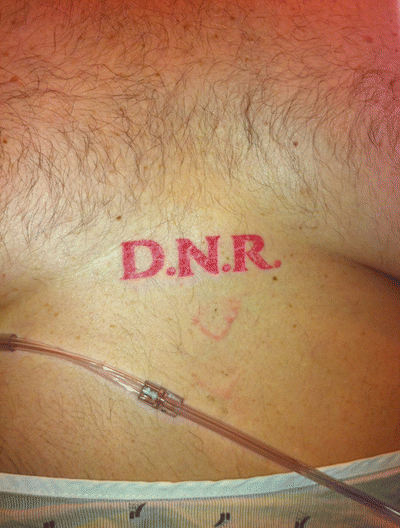
Fig. 2 – Photograph of patient’s tattoo that was regretted (Image: Cooper, JGIM)
In context of these situations, the rhetorical implications of a “Do Not Resuscitate” tattoo have serious consequences for patients and their families, as well as for the field of medicine as a whole. However, in each case, a rhetorical analysis is completed based on the aggregation of discourses at the time, which is continually being modified and updated to reflect a changing society, and its changing values.
References
Bever L. A man collapsed with ‘Do Not Resuscitate’ tattooed on his chest. Doctors didn’t know what to do. Washington Post. December 1, 2017. https://www.washingtonpost.com/news/to-your-health/wp/2017/12/01/a-man-collapsed-with-do-not-resuscitate-tattooed-on-his-chest-doctors-didnt-know-what-to-do/. Accessed February 2, 2018.
Cooper L, Aronowitz P. DNR Tattoos: A Cautionary Tale. Journal of General Internal Medicine. 2012; 27(10):1383-1383. doi:10.1007/s11606-012-2059-8.
Fortin J. His Tattoo Said ‘Do Not Resuscitate.’ Doctors Wanted Another Opinion. New York Times. December 4, 2017. https://www.nytimes.com/2017/12/04/us/do-not-resuscitate-tattoo.html. Accessed February 2, 2018.
Holt GE, Sarmento B, Kett D, Goodman KW. An Unconscious Patient with a DNR Tattoo. New England Journal of Medicine. 2017; 377(22):2192-2193. doi:10.1056/nejmc1713344.
Khullar D. We’re Bad at Death. Can We Talk? New York Times. May 10, 2017. https://www.nytimes.com/2017/05/10/upshot/were-bad-at-death-first-we-need-a-good-talk.html. Accessed February 2, 2018.
Despite all of the writing classes I have taken, I don’t really consider myself particularly adept at writing compelling prose. In fact, I think my writing skills have deteriorated over the years. When I look back at my work from high school and even pre-high school years, I am often surprised by it’s quality and then think to myself, “Did I really write that?”
Maybe one contributing factor is that I decided to pursue a scientific discipline. In science writing, we are constantly extolled of the virtues of direct and concise writing, and from this I think my writing has become quite dry and literal — not at all enjoyable to read, but very clear. There are certainly advantages to this style, but I think it’s valuable to explore different avenues of creative expression, including narrative prose and even screenwriting.
As I’ve been thinking this through in detail, I realized that this shift is not uncommon, and is especially evident when observing people’s speech. Eventually as we mature, we develop a certain linguistic style. As our mastery of language comes more easily, we develop heuristics that we can rely on when we want to convey as specific message. We begin stringing together these building blocks rather than synthesizing new ways of communication entirely from scratch. The end result is that we keep using similar language and similar style.
Heuristic: a technique used to arrive at a practical solution without directly solving the problem itself
That over reliance on these heuristics is, I think, a major contributing factor to the reduction in creativity that I struggle with.
Looking back at my old writing, what sticks out the most is the vocabulary. In middle school, we’re still learning how to express ourselves through writing. We don’t yet have a grasp on the intricacies of life, and we’re constantly trying to prove ourselves. For that reason, we’re constantly experimenting with language and how we use words to express ideas — often incorrectly in my case 🙂 Yet experimentation is what fosters creativity. Maybe we no longer experiment for fear that we may be wrong or appear foolish.
There’s nothing wrong with having a consistent style. But for me, being cognizant of the heuristics that I rely on pushes me to experiment a bit more and if in that process I can be more interesting, then I don’t mind being foolish! At the end of the day, I hope that this allows to think introspectively about our writing. I think that when we examine our own linguistic biases, we tend to better understand the limitations of writing and communication.
My final revision of the font is complete!
![]()
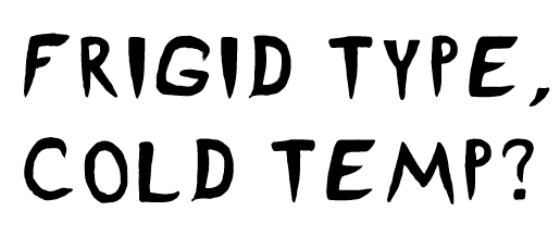
The artist statement is as follows.
Frigid was designed as a title typeface for the Escape Room, “Revenge of the Yeti,” held at Worcester Polytechnic Institute. The escape room was themed around an icy mountain expedition gone wrong when the group is confronted with a Yeti and has to figure out what to do! Once called Ice Pick, the typeface was renamed to Frigid to better reflect its new focus on the sense of cold, frigid temperatures and the panic that someone would feel on such an expedition. The sharp features, especially evident on the I, symbolize icicles. However, the P was designed to be almost exactly the same shape as a piton, a metal spike that is driven into the rock or ice to make a hook that they can attach their safety gear to. The typeface is designed to convey the icy bite of the frigid temperatures and evoke a sense of danger and fear from the sharp, claw-like serifs intended to be reminiscent of the feeling of a Yeti around the corner, and overhangs that elicit the feeling of being trapped in an ice cave. The large, all-caps letterforms provide an emphatic sense of urgency that can be used in banners and logos as well as in title cards and event flyers. Frigid was designed to use pathos to invite readers to feel the same emotions that a group of trapper mountaineers would when faced with the frigid temperatures, mountainous terrain, and harsh winds. The letters in Frigid have distinctive icicle-like features incorporated into the letterforms, especially evident with the letter “I.” There are harsh angles and sharp, curvy wisps built into the letterforms that exude the feeling of strong, chilly winds biting into your face. The letters also incorporate features of tools commonly used on mountainous terrain such as the letter “E” being the spikes on a climbing boot. Yet at the same time the typeface was designed to be geometric so that it can be applicable to a number of different use cases.

I realized that although the comic needs to be polished up, I wanted to work on redoing the typeface project so that it could be more useful as an actual typeface and hopefully be used.
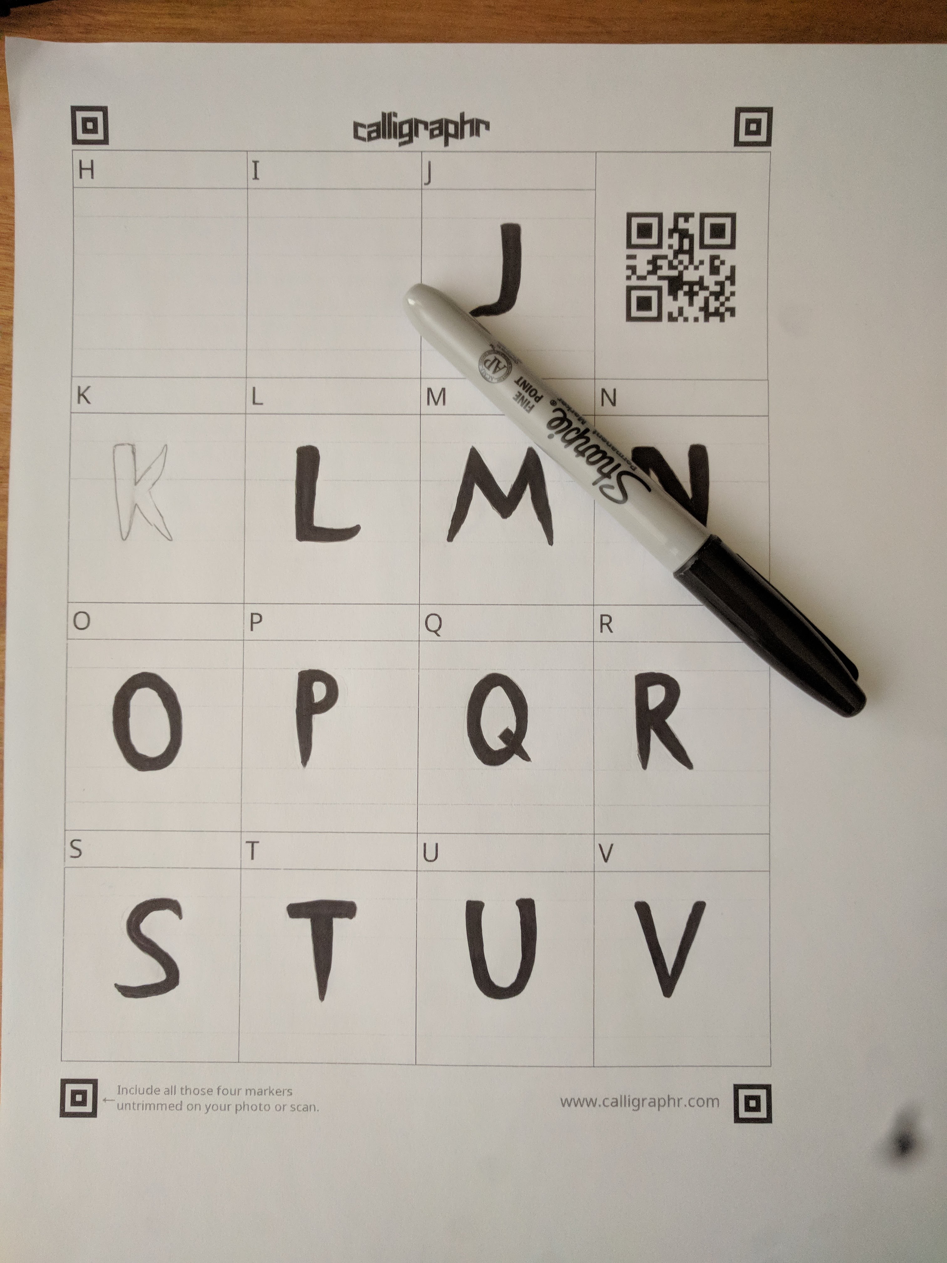
I decided to also work on my font and bring it into better shape. I thought that using the hand drawn approach really adds character to the font and helps convey the vision of a scary Yeti being around the corner and the cold temperatures. However, hand drawing all of the letters with pencil, as we did, made the font be an outline instead of completely filled. We didn’t have much time to fix that during the font unit, so I thought it would be great to go back and really make the font a complete and polished typeface. Also, the outline occasionally had slight breaks in it due to the variations in stroke that the scanned pencil lines had. In addition to filling in all of the letters, I decided to give the font a more cohesive look by redoing the entire second half of the alphabet according to the same style that I drew the first half in. I also wanted to add some more punctuation marks so that the font would be more usable, such as a question mark and a comma. Although I think adding the lowercase glyphs would be interesting, I think it is outside of the scope of this project. Instead, I decided to make the entire font be in capital case by replacing all of the lowercase glyphs with the uppercase glyphs, so that no matter how you type, whether it is in a lowercase or using caps-lock, the letters always appear and they appear to be capitalized. That was one problem with the previous draft, because if someone typed in lowercase, the glyphs would be replaced with standard glyphs or with an unknown character mark. Some fonts already do this same thing where no matter which case you type in the letters are capitalized. For example, Algerian and Castellar do this.
In order to create the filled letters, I used a sharpie instead of a pencil, and made sure to fill in any areas with ink instead of leaving them empty. This also made the letters much darker and thus easier to scan in. I used Calligraphr again to turn the scans into an actual font and downloaded the OTF file from there. I honestly thought it would automatically fill everything in to make the final letterforms, but instead it used the scans as is. I used their template called “Minimal English” which contained the most frequently used characters, including punctuation such as a colon, comma, and quotation marks. However, to make sure that I didn’t make any mistakes, I first drew the glyphs in with a pencil and went over it with sharpie.
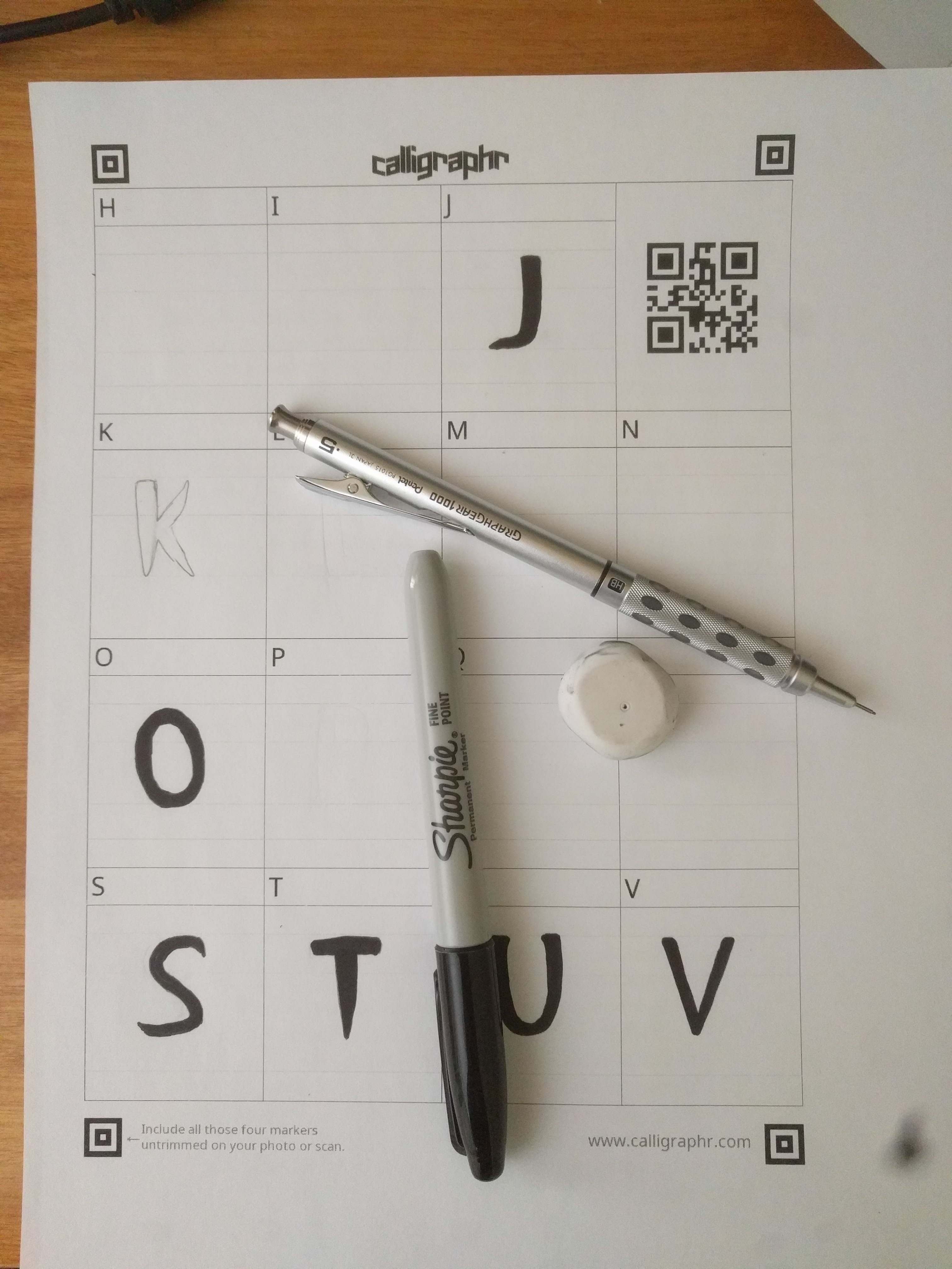
As much as I wanted to reuse the glyphs I had already drawn, the first half of the alphabet and the punctuation in the previous draft, I decided to redraw all of them which took significantly more time. However, this made sure that the entire font was cohesive and fit the same style rather than having a clear split in the middle of two slightly different ideas.
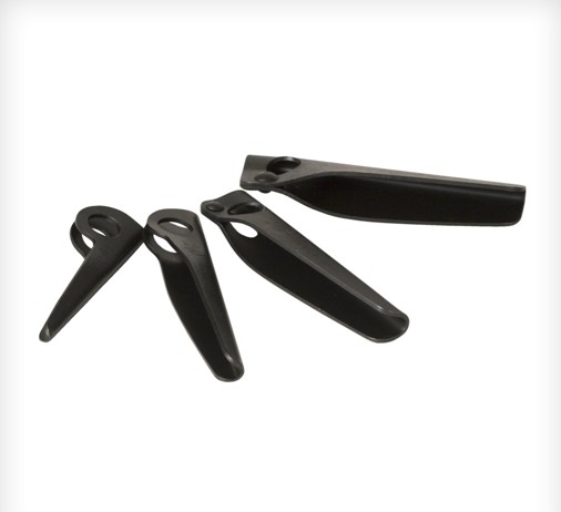
I want to reiterate the intended purpose of the typeface. It was designed for an escape room held at WPI, themed around an “Escape from the Yeti” during an expedition to Mount Everest. Some of the terms we were given to research are listed below. Because my second draft font still has the same general stylistic elements as the previous, I used the same inspiration images to help bring the style to life.
- Everest expedition
- Sherpas
- Cold
- Tents
- Oxygen
- Yeti
As previously I wanted to keep the font in a geometric style so that it can also be used outside the scope of this project and in other cases.
![]()
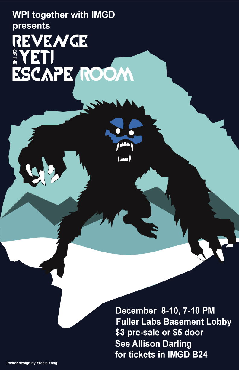
I decided to rename the font from “Ice Pick” to “Frigid,” which I thought better represented my intentions with the typefaces and also served to broaden the potential usability of the font. Instead of focusing on the Yeti aspect of the design, I decided to focus more on the cold, frigid, part. This decision made the entire project more challenging because representing these concepts with simple geometric shapes is much more difficult than if I were to use a more literal typeface, such as by sweeping the letterform in Photoshop or in Gimp to have an icy look.
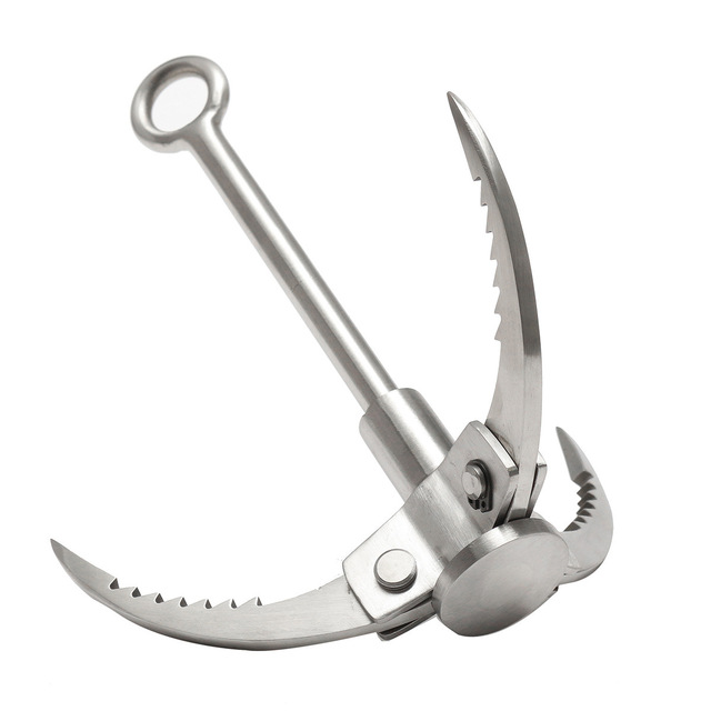
The period and point of the exclamation mark were intended to resemble an ice cube, as well as the period and comma. However, the comma and semicolon were intended to resemble the teeth of the Yeti. The question mark was styled to look like a grappling hook that a mountain climber might use. However, the P was designed to be almost exactly the same shape as a piton, a metal spike that is driven into the rock or ice to make a hook that they can attach their safety gear to.
By using the serifs around the C, the letterform was intended to resemble the tool that ice harvesters would use to grab ice out of the water.
Although I wanted to add some more elements of the Yeti to the O, I decided against it so that the font would be more usable in different cases. The Q resembles the O as if someone drove an icicle through it.
I decided against using a vector based typeface designing program such as Type Light or Illustrator because I felt that I would lose the essence of the font. Hand drawing the letterform gives a character to the typeface that is almost impossible to achieve with digital programs despite the numerous advantages that they do provide. Before uploading my scans to Calligraphr, I modified and fixed up certain elements that I had messed up slightly or wanted to be more refined in Gimp.
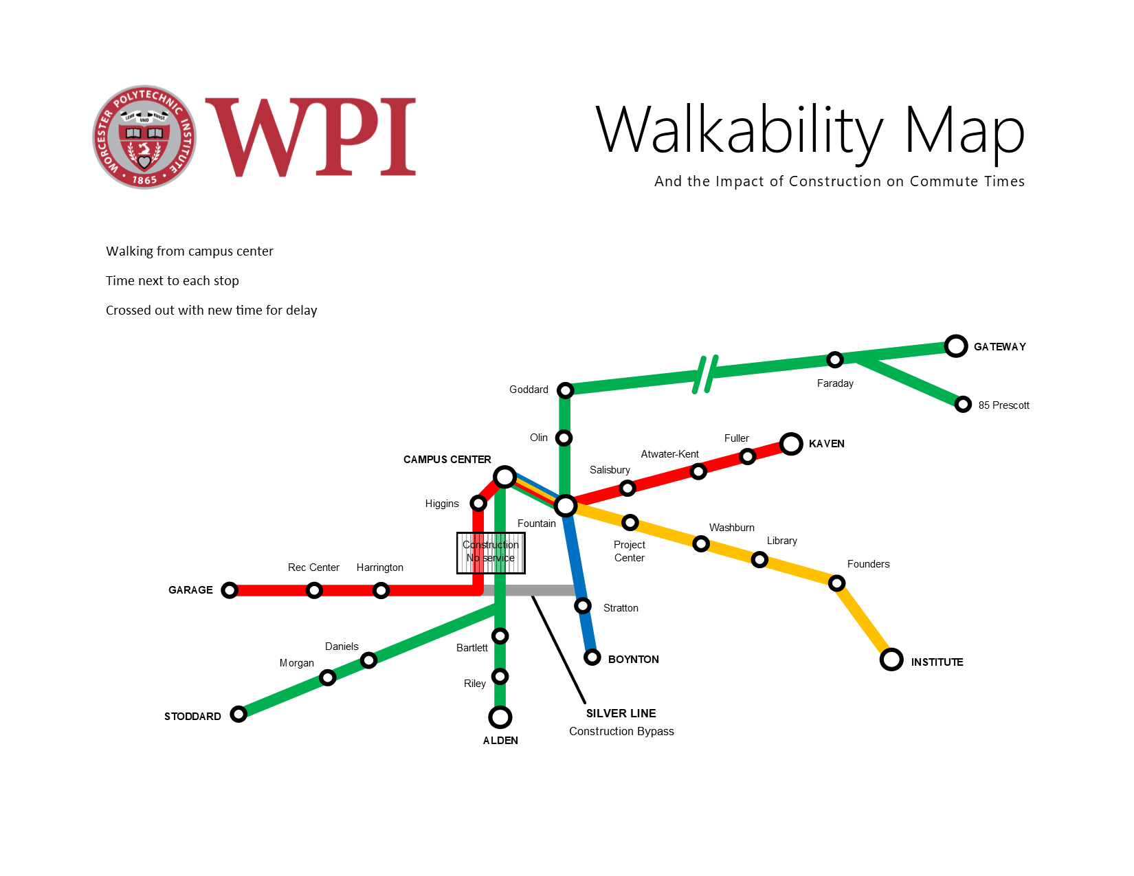
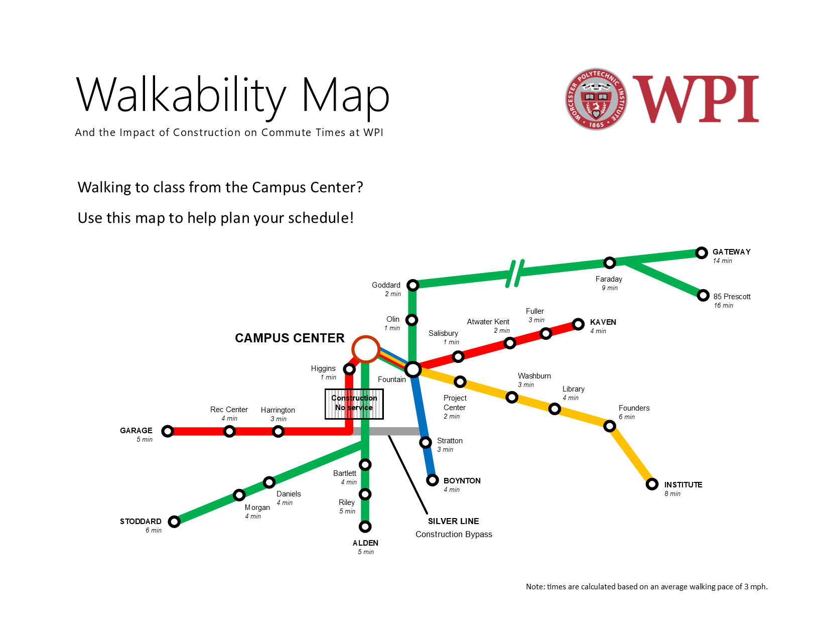
Our final draft of the WPI Walkability Map is complete!
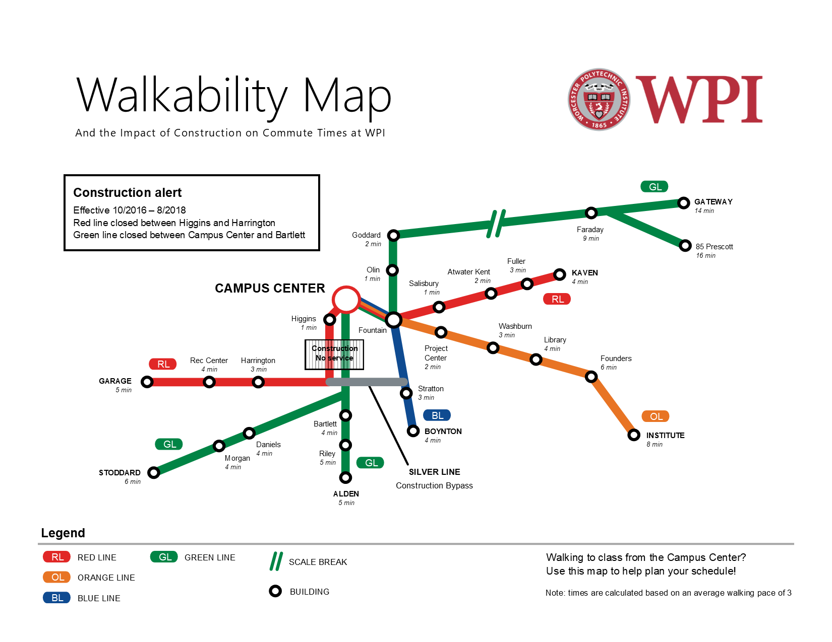
Our artist statement is as follows:
The purpose of our subway-themed walkability map is to show students in the Campus Center the time it takes to walk to various buildings around campus in order to help them plan their schedule and show the severe impact of the construction site and the delays it causes between certain parts of campus. The intended audience of our map is WPI community members in the Campus Center, and we plan on having the map printed at poster size and hung on a wall or near the door. To accomplish our goal, we designed our map to have some of the same visual characteristics as the subway style of the MBTA rapid transit map. We intended that these deliberate design choices would subconsciously make the map familiar to those from around the Boston area and assert its authority by making it seem as if it were an official document. We styled the color choice to match that of the MBTA, the font used for the labels, as well as the style of the legend. The deliberate similarities also extend to the way the names of the last stop are written in all caps and bold, the labeling of the individual lines, as well as the nomenclature of the lines themselves as colors (i.e. green line, red line, etc.). The silver color of the “construction bypass” line on our map is a subtle reference to Boston’s silver line, which—deceptively—is a bus rather than a train, and as such is slow. A person familiar with Boston’s rapid transit system will get this insider joke and identify more closely with the map. While these stylistic elements will be effective with audience members from this area, others appeal to a broader audience. We decided to have the Campus Center be the central point of our map from which walking times are measured. Because the construction site is directly next to the campus center, and in order to get from the Campus Center to the quad students now have to walk completely around Higgins, the impact of the construction is greatest there. The organization of the lines and stops is done so that more “train transfers” are required to get between certain buildings with the construction site present than without it, which emphasizes the impact. The map style is rhetorically effective because it condenses the pertinent information and presents it in a simple and clean look. There are often significant amounts of unnecessary details in geographic maps, which end up distracting the end user that simply wants to know how to get from one point to another. The subway style helps distill the information and presents only the most important and useful information specifically for transit. However, the style does have some limitations due to its simplicity and geometric look. This map is not intended for giving directions but rather for schedule planning for trips starting from the Campus Center.
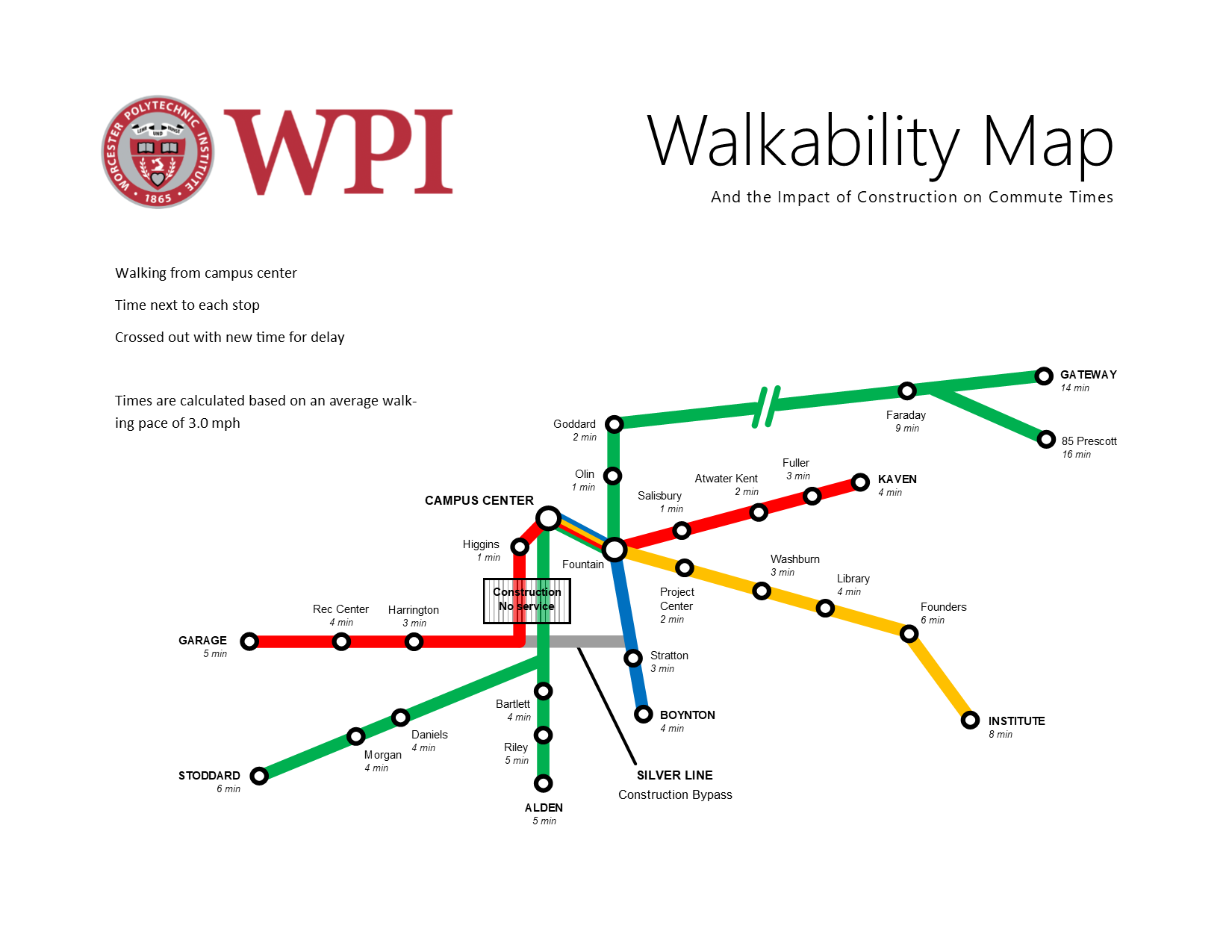
In order to make our purpose clearer, we got advice from Professor deWinter. She made a number of suggestions using her trademark sharpie method – drawing all over a printed copy! This time before presenting it to her, I made sure to include the actual times in minutes which is hopefully much more relevant than distance or steps needed. This took a lot of time to get finished because we needed to calculate the times from each station based on an average walking pace of 3 miles per hour. However, the most challenging part was actually making sure everything was lined up and that the times were all italicized and in smaller font – just a lot of manual labor!
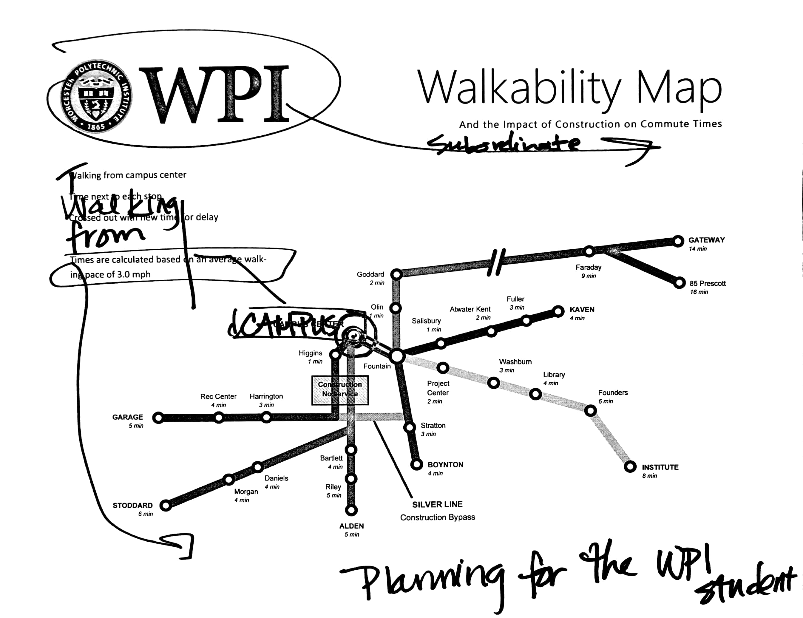
Based on her advice we made a number of changes, as shown below.
At the same time as the map unit we were assigned a final project. However, I just haven’t had much time to muse over what I wanted to do until now. For the final project, I decided to revise and add to the previous comic project and bring it to a more final and “publishable” document. I really like Greta and Ben’s idea of having a fillable worksheet at the end so that the reader can apply the comic story to their own college plan. I thought that it would be really nice to add something like that to our comic so that it could potentially be used at New Student Orientation or as handout material during the humanities requirement presentations. Professor deWinter also mentioned to use Illustrator to convert the hand drawn files to vector graphics, exactly as Caroline and Katie had done with their drawing of Gompei the goat!
As an additional side note, I have commented significantly outside of my blog group. Also, I love Brandon‘s blog style which continues to inspire me to do better documentation on my own site!
Our first draft of the map was not to scale. However, we soon revised that to make it more clear what we were trying to convey, that is, how long it takes to walk between buildings on Campus.

Our second draft was to scale (as best as possible).

Some feedback that we got from the class was:
- make the text larger
- make the map more recognizable as WPI
- move the Campus Center to the correct location in relation to the fountain
- make Gateway path less out of scale
Most importantly, however, we realized that the purpose that we intended, to show students how long it would take to get from the Campus Center to another point on campus, was not immediately clear. This is definitely something we need to work on, since our purpose must bend to the limitations of the subway style, even if we were to take many liberties and depart more from the style. Essentially, the important feedback we got was to make our purpose as clear as possible. Because of the subway style, it was necessary to narrow down the map to represent just trips from the campus center. If you were to originate at a different location, you wouldn’t necessarily go on the same path as depicted in the map. Making this clearer is definitely the next step, but something I think will be quite difficult because of the conditional rhetoric of subway maps – people are used to being able to go from any point to another. One possible way to solve this is to simply have the map not be distributed to students and instead be hung on the wall of the Campus Center. This solves the problem of where people start, as well as making the text even larger and easier to read from a distance.
In order to address the problems mentioned above from the feedback session, we spent quite some time after class and made another draft that includes the WPI logo and the text, “Walkability Map; and the impact of construction on commute times” to hopefully narrow down that the map is in fact a depiction of WPI and that we intend for it to be used to determine walking times. We didn’t make the text much larger, but instead we emphasized the ending lines to make it more similar to the MBTA map. We also rearranged quite a bit of the lines to make everything cleaner and evenly spaced. Although, there are still some elements especially towards the core of the map that simply cannot be put into the proper scale, such as the construction area, the distance between Higgins and the Rec. Center, and the distance between the Campus Center and the fountain. Regardless, it is in much better shape than the previous draft.