I think for any artistic endeavor, it is important to start by defining the goals. For this project in particular, we were to design a typeface for an “escape room” hosted at WPI. As such, I think it should be made to exhibit specific characteristics that enhance the experience of being trapped in a room and finding ways to escape.
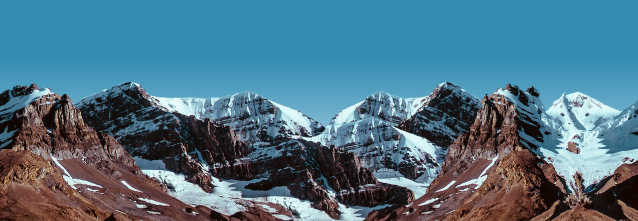
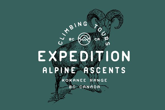
The general theme of the escape room is an expedition to Mt. Everest.
To begin, I started by researching various sources of inspiration so that I would have a better idea of what experience or feeling to represent visually through the typeface, and what elements might be stereotypically related to the idea of a Himalayan mountain expedition. We were given a list of keywords that would aid in that:
- Everest expedition
- Sherpas
- Cold
- Tents
- Oxygen
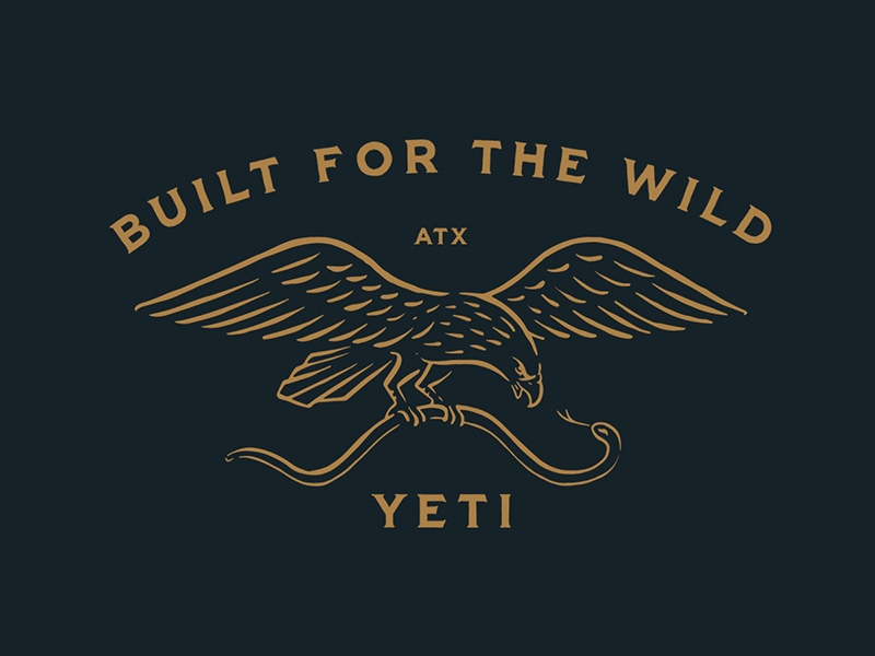
- Yeti
I wanted to start by creating a sort “mood room,” or in this case, a set of images I found online that would provide an inspiration to begin the design process and to make sure that the typeface continues to develop in the direction of the escape room and mountain expedition concept.
To start on ideating the project, I decided it might be finally useful to make some sketches by using my Wacom graphics tablet. Unfortunately when I removed it from storage and began using it, the sensitivity of the clicking mechanism and pressure detection seemed completely broken. Although I attempted to fix it for a number of hours, it was all to no avail. I think I will need to order a replacement pen or get a completely new graphics tablet. Consequently I will need to do everything on paper and later transfer to the computer.
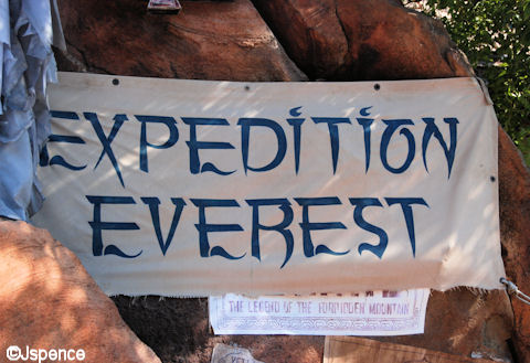
There are two stereotypical ideas for a Yeti that I have found. First, is the scary snow bigfoot, and second is a cuter, more approachable creature that serves as a guardian to the ice caves or mountain. The guardian concept would fit with the sense of a looming letterform, with tall letters that have substantial mass at top makes you feel small in relation and feel like you are in the presence of a large creature such as a Yeti. The sharper characters might fit better with the frigid idea, but I still have not decided which one would make more sense in this application.
The “I” represents an icicle forming, but without cluttering up the rest of the font by installing small icicles on every letter.
I am slightly torn between a thick, punchy, and gothic look and thin, airy, yet frigid look. The problem arises because my idea for a frigid character involves using sharp serifs on the upper edges and a sweeping sharp curve on the descenders. However, my idea for a “looming” letterform needs to be slightly rounded in order to convey that type of feeling of, not “imminent” but almost so.


Greta S. Jarvi
I am eager to see your designs for these two ideas! The two ideas you describe, looming letters and frigid letters, both seem to illustrate important facets of an Everest expedition. I might have a slight inclination towards the frigid characters. I like how you would include icicles on some but not all of the letters; you are designing with purpose and not haphazardly placing things randomly. I think this design is clean, crisp, and still effective at its purpose of giving a brand to the winter escape room.
Maiya J. Mitchell
The “Everest Expedition” font is a good idea, if you are debating which style to still choose from. I particularly like the top-heavy and sharp design. It feels like it fits the escape room description and also has a little Nepali language touch to it!