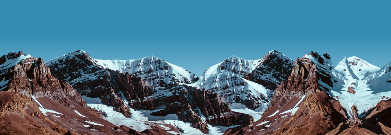
The font started out with two main characters, both in the sense of as a literary character and as letterform. The “F” and “I” were critical to the design language, with the I primarily intended to be an icicle dangling.
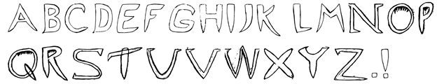
I wanted the font to be a bit more abstract, and so rather than showing icicles directly dangling off of the letters, I made sure to style the letters to resemble the icicles themselves. didn’t want the font to be too literal, and show icicles hanging off the individual letters.
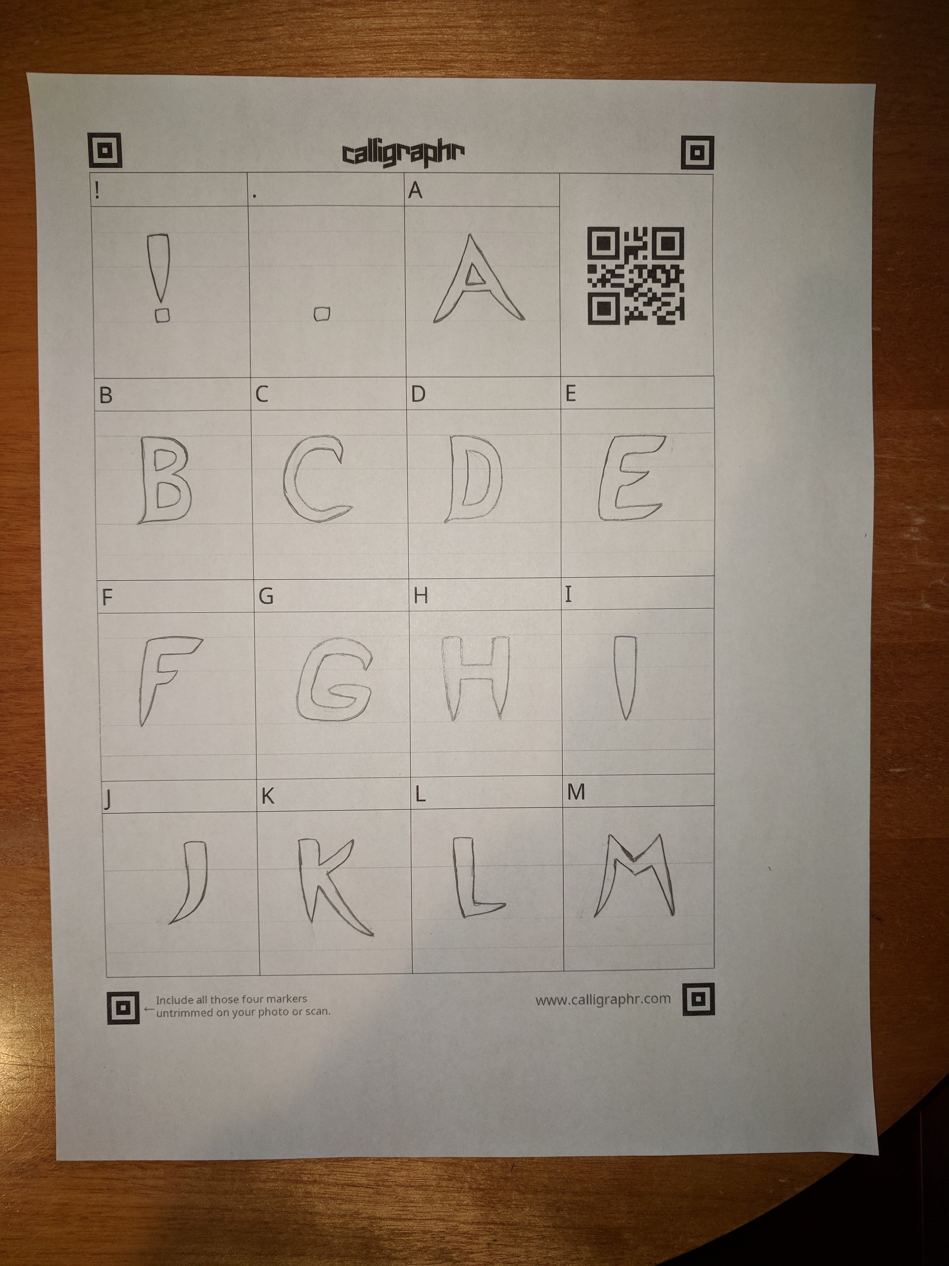
Although I had originally planned on using TypeLight, I decided to go with Calligraphr instead because of its simplicity in creating glyphs from scanned images. Because most of the letterforms were not geometric, they did not lend themselves to simple Bezier curves. Therefore, it was easier to upload a scanned version of the typeface into the tool and modify the letterforms there.
Our artist statement is as follows:
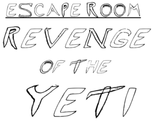
Ice Pick is designed as a title typeface for an escape room on the Worcester Polytechnic Institute campus. The escape room is themed around an icy mountain expedition gone wrong when the group gets confronted with a Yeti and has to figure out what to do! The typeface is designed to convey the icy bite of the frigid temperatures and evoke a sense of danger and fear from the sharp, claw-like serifs intended to be reminiscent of the feeling of a Yeti around the corner, and overhangs that elicit the feeling of being trapped in an ice cave. The large, all caps, letterforms provide an emphatic sense of urgency that can be used in banners and logos as well as in title cards and event flyers. Ice Pick was designed to use pathos to invite readers to feel the same emotions that a group of trapper mountaineers would when faced with the frigid temperatures, mountainous terrain, and harsh winds. The letters in Ice Pick have distinctive icicle-like features incorporated into the letterforms, especially evident with the letter “I.” There are harsh angles and sharp, curvy wisps built into the letterforms that exude the feeling of strong, chilly winds biting into your face. The letters also incorporate features of tools commonly used on mountainous terrain such as the letter “E” being the spikes on a climbing boot and the letter “T” resembling the typeface namesake, an ice pick.
Ryan Cudemus-Brunoli
I’m a big fan of the progress you’ve shown in comparison to your other font postings. The sharpness of your letters definitely alludes to the ice motif you’re using, and the serifs on some letters does create an icy windswept look. Your artist statement also matches up well with the visible style you went for with the font.
Jack Tulloch
I think that we did a pretty good job on this font. The sharpness really lends its self the the harsh environment and while there are no immediate icicles you realize that the entire letter is one. the artist statement meshes well with the font as well. Good work!