Visual Rhetoric

The modern world hinges on the ability to create better user experience through carefully crafted design.

Information Graphics 1

In today’s visual world, a lot of information is conveyed through information graphics, such as the technical drawings engineers use to show a product idea to various mathematical graphs helping visualize the complex cryptographic functions used to secure the internet. For this next project, we will be designing our own information graphic

Unlike the previous typeface project, we are working in groups of three from the start. Our group consists of Brandon Sanders, a CS and professional writing major, and Henry Stadolnik, a CS and IMGD major and of course myself. I am excited to get to know them better and begin work on an information graphic!

The assignment appears relatively simple and open-ended. As a class, we voted on various topics, such as “majors and professional development at WPI” and  “environmental issues and sustainability.” We decided to go with the topic of “majors and professional development at WPI.” Because we were first asked to brainstorm three ideas for various information graphics. My initial thoughts immediately went to Kurzgesagt, a great YouTube channel dedicated to information graphics, albeit videos whose mission is to “make science look beautiful. Because it is beautiful.”

I love the simplistic visual style of their videos, which contrasts nicely with the complexity of their topics. Their explanations are always clear and easy to understand, yet at the same time entertaining and fun, something  critical in the modern world and its online-first philosophy. We strive to do the same with our own information graphic.

Our readings and class discussions made us realize that good information graphics have a central narrative; that is, they tell a story with the information. Good information graphics have a purpose; they don’t just plop information on the page and expect the reader to understand its significance or what to do with the information, but rather carefully design the graphic so that at the end, the reader is persuaded to do something or change their opinion, often in very subtle ways that are not immediately noticeable or obvious. I think Kurzgesagt does a great job in that regard.

The various general topics I thought about are as follows:


reduction of war
genetically modified organisms
automation of jobs, including white collar – professional development at WPI
artificial intelligence
antibiotic resistance
corporate rights
intellectual property

As the class discussed ideas, I realized that automation of jobs fits nicely into the category of professional development, which I could spin specifically for WPI. Hence, I decided to select it as the final topic.

Final Draft – Ice Pick

The font started out with two main characters, both in the sense of as a literary character and as letterform. The “F” and “I” were critical to the design language, with the I primarily intended to be an icicle dangling.

I wanted the font to be a bit more abstract, and so rather than showing icicles directly dangling off of the letters, I made sure to style the letters to resemble the icicles themselves. didn’t want the font to be too literal, and show icicles hanging off the individual letters.

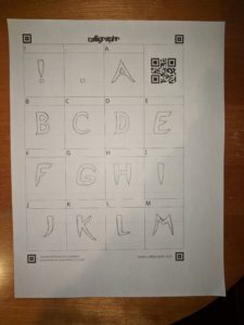
Although I had originally planned on using TypeLight, I decided to go with Calligraphr instead because of its simplicity in creating glyphs from scanned images. Because most of the letterforms were not geometric, they did not lend themselves to simple Bezier curves. Therefore, it was easier to upload a scanned version of the typeface into the tool and modify the letterforms there.


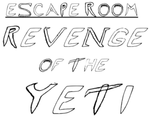
Our artist statement is as follows:

Ice Pick is designed as a title typeface for an escape room on the Worcester Polytechnic Institute campus. The escape room is themed around an icy mountain expedition gone wrong when the group gets confronted with a Yeti and has to figure out what to do! The typeface is designed to convey the icy bite of the frigid temperatures and evoke a sense of danger and fear from the sharp, claw-like serifs intended to be reminiscent of the feeling of a Yeti around the corner, and overhangs that elicit the feeling of being trapped in an ice cave. The large, all caps, letterforms provide an emphatic sense of urgency that can be used in banners and logos as well as in title cards and event flyers. Ice Pick was designed to use pathos to invite readers to feel the same emotions that a group of trapper mountaineers would when faced with the frigid temperatures, mountainous terrain, and harsh winds. The letters in Ice Pick have distinctive icicle-like features incorporated into the letterforms, especially evident with the letter “I.” There are harsh angles and sharp, curvy wisps built into the letterforms that exude the feeling of strong, chilly winds biting into your face. The letters also incorporate features of tools commonly used on mountainous terrain such as the letter “E” being the spikes on a climbing boot and the letter “T” resembling the typeface namesake, an ice pick.

Next Steps

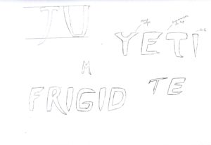
I began by sketching various samples based on the ideas that I described previously.

Initially, I thought to use a vector based program such as Adobe Illustrator. After designing various elements of the typeface by sketching on paper, I scanned the sketches and inserted them into a new Illustrator document, hoping to be able to trace over the elements with the Bezier curve pen tool. However, this proved extremely difficult in Illustrator for a number of reasons, primarily being that I was not extremely familiar with the interface and its advanced curve editing functions. Consequently, after spending a couple of hours attempting to create the necessary glyph elements, I decided to abandon Illustrator in favor or TypeLight. I searched for other programs online and discovered FontForge. However, this also seemed rather complex. Reading through the blog posts of other students, I noticed that Ryan recommended using TypeLight for its simplicity in digitizing fonts.

UPDATE: A new partner!

I am now working with Jack Tulloch on a typeface design!

Preparing for the Expedition

I think for any artistic endeavor, it is important to start by defining the goals. For this project in particular, we were to design a typeface for an “escape room” hosted at WPI. As such, I think it should be made to exhibit specific characteristics that enhance the experience of being trapped in a room and finding ways to escape.

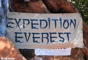
The general theme of the escape room is an expedition to Mt. Everest.

To begin, I started by researching various sources of inspiration so that I would have a better idea of what experience or feeling to represent visually through the typeface, and what elements might be stereotypically related to the idea of a Himalayan mountain expedition. We were given a list of keywords that would aid in that:

  • Everest expedition
  • Sherpas
  • Cold
  • Tents
  • Oxygen
  • Yeti

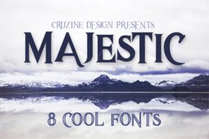
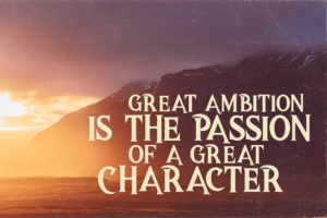
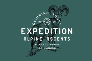
I wanted to start by creating a sort “mood room,” or in this case, a set of images I found online that would provide an inspiration to begin the design process and to make sure that the typeface continues to develop in the direction of the escape room and mountain expedition concept.

To start on ideating the project, I decided it might be finally useful to make some sketches by using my Wacom graphics tablet. Unfortunately when I removed it from storage and began using it, the sensitivity of the clicking mechanism and pressure detection seemed completely broken. Although I attempted to fix it for a number of hours, it was all to no avail. I think I will need to order a replacement pen or get a completely new graphics tablet. Consequently I will need to do everything on paper and later transfer to the computer.

There are two stereotypical ideas for a Yeti that I have found. First, is the scary snow bigfoot, and second is a cuter, more approachable creature that serves as a guardian to the ice caves or mountain. The guardian concept would fit with the sense of a looming letterform, with tall letters that have substantial mass at top makes you feel small in relation and feel like you are in the presence of a large creature such as a Yeti. The sharper characters might fit better with the frigid idea, but I still have not decided which one would make more sense in this application.

The “I” represents an icicle forming, but without cluttering up the rest of the font by installing small icicles on every letter.

I am slightly torn between a thick, punchy, and gothic look and thin, airy, yet frigid look. The problem arises because my idea for a frigid character involves using sharp serifs on the upper edges and a sweeping sharp curve on the descenders. However, my idea for a “looming” letterform needs to be slightly rounded in order to convey that type of feeling of, not “imminent” but almost so.


Hello world!

Welcome to WordPress. This is your first post. Edit or delete it, then start blogging!

Page 16 of 16

Powered by WordPress & Theme by Anders Norén