My final revision of the font is complete!
![]()
The artist statement is as follows.
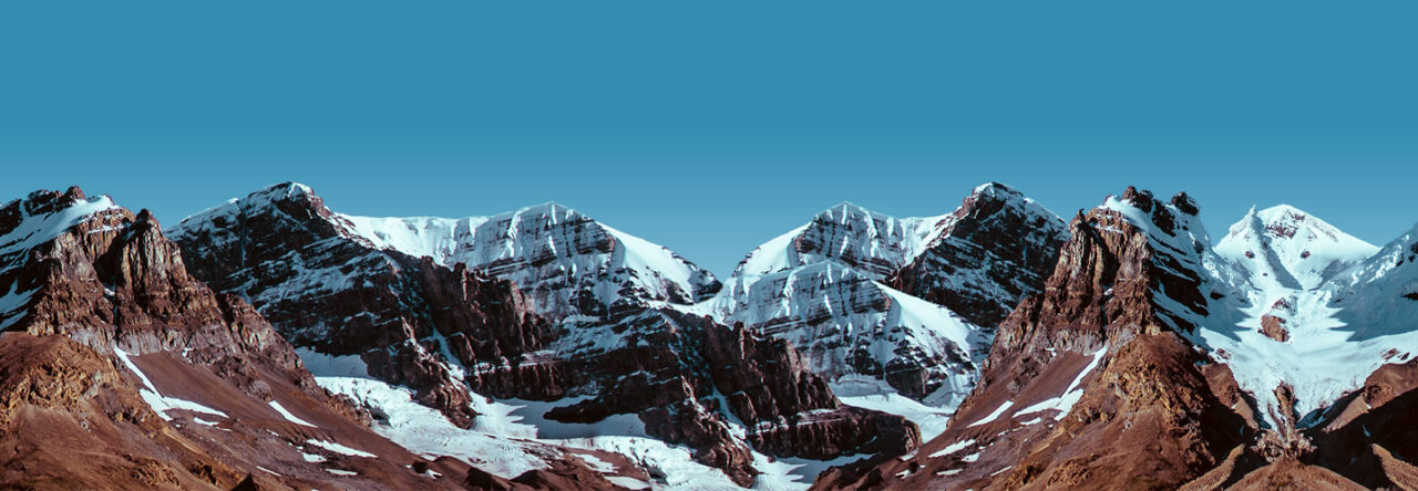
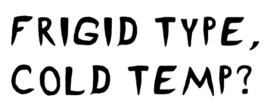
Frigid was designed as a title typeface for the Escape Room, “Revenge of the Yeti,” held at Worcester Polytechnic Institute. The escape room was themed around an icy mountain expedition gone wrong when the group is confronted with a Yeti and has to figure out what to do! Once called Ice Pick, the typeface was renamed to Frigid to better reflect its new focus on the sense of cold, frigid temperatures and the panic that someone would feel on such an expedition. The sharp features, especially evident on the I, symbolize icicles. However, the P was designed to be almost exactly the same shape as a piton, a metal spike that is driven into the rock or ice to make a hook that they can attach their safety gear to. The typeface is designed to convey the icy bite of the frigid temperatures and evoke a sense of danger and fear from the sharp, claw-like serifs intended to be reminiscent of the feeling of a Yeti around the corner, and overhangs that elicit the feeling of being trapped in an ice cave. The large, all-caps letterforms provide an emphatic sense of urgency that can be used in banners and logos as well as in title cards and event flyers. Frigid was designed to use pathos to invite readers to feel the same emotions that a group of trapper mountaineers would when faced with the frigid temperatures, mountainous terrain, and harsh winds. The letters in Frigid have distinctive icicle-like features incorporated into the letterforms, especially evident with the letter “I.” There are harsh angles and sharp, curvy wisps built into the letterforms that exude the feeling of strong, chilly winds biting into your face. The letters also incorporate features of tools commonly used on mountainous terrain such as the letter “E” being the spikes on a climbing boot. Yet at the same time the typeface was designed to be geometric so that it can be applicable to a number of different use cases.
