
Recently, during a meeting with the Worcester Free Care Collaborative, it was announced that the organization is looking for new logo submissions to overhaul their current identity branding. Though I haven’t done anything like this in quite some time, I thought it would be great to write about my artistic endeavor and perhaps hearken back to my original posts here on this blog. After all, this blog has thus far been called “Visual Rhetoric.”
Being familiar with the work that the organization does is certainly a major benefit in designing an identity that fits its mission and communicates its ideals in a simple and clear manner.
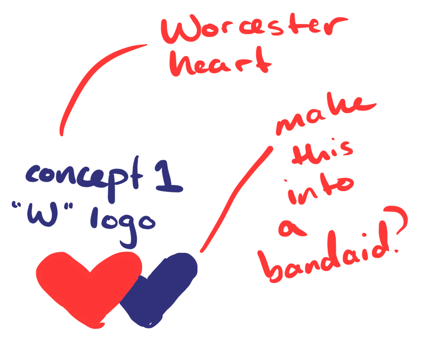
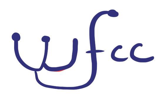
The first step, of course, is to come up with a list of important concepts or ideas that might be included in the logo. One of the first logos I had come up with for the newsletter, “Dispatches from the Worcester Free Clinic Coalition”—back when the organization had that as its name—I used the letters as is. This was a look inspired by Proto Magazine, which has a similar style.
- The letter “W” and potentially the others as well
- Something to tie the logo to the City of Worcester
- A “softness” that represents a welcoming connection to the community
- An air of “authority” to represent the organization as a center for health
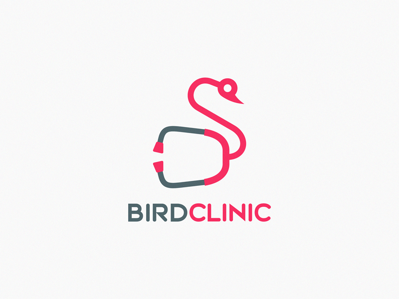
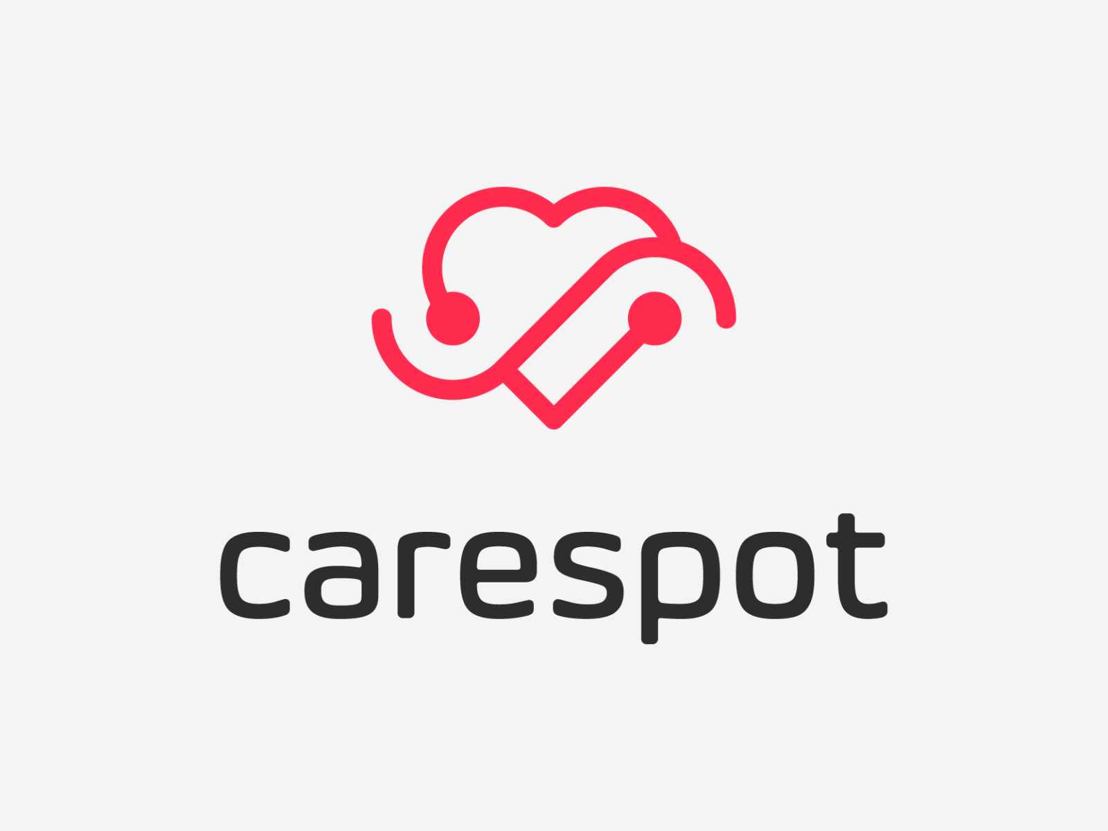
I searched Dribbble for inspiration, and most of the inspiration examples are from various artists that uploaded their work there.


I really wanted to include a heart as a motif that symbolizes the City of Worcester and its place as the “Heart of the Commonwealth.” I first learned of this at WPI, where it is also featured in the school seal. The symbolism of the heart lends itself perfectly to the medical nature of the Worcester Free Care Collaborative, which will hopefully make it easy for patients and the community to make the connection to health care. As a result, I settled on having a heart in the logo quite early on. This helped narrow my focus when doing research into other designs.
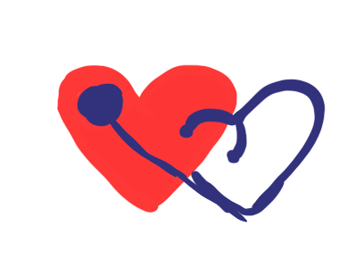
The second design was an attempt to recreate the clean “wfcc” logo above, but integrate a stethoscope into the letterforms. However, it was thrown out pretty early on, simply because it wasn’t aesthetically pleasing. I think it would have been challenging to make the lines flow well without having an area where the lines extended beyond the unconscious limits of the logo shape. It just didn’t work well.
Initially I was hesitant to go with a vibrant and colorful logo because I wanted it to seem somewhat reserved. This is a medical organization after all, and it’s important to communicate its serious nature. Simple lines can help with this, but go too simple, and it becomes “minimalist.” This type can easily be associated with tech startups—not something that I necessarily wanted.
However, I liked the idea of including a stethoscope. It succinctly introduces the idea of medicine, even to those who are uninitiated. It’s a common trope, but in this case, works well. When playing around with it a bit more, I immediately recognized the potential power of a stethoscope and heart combination. The heart, obviously represents the physical human heart, but it also represents the City of Worcester. Double symbolism there! Totally on purpose!
I realized that the stethoscope could form the other part of the “W” when layered on top of the heart. However, I felt that the “W” part wasn’t as easily visible, so I decided to fill it in with a contrasting color.
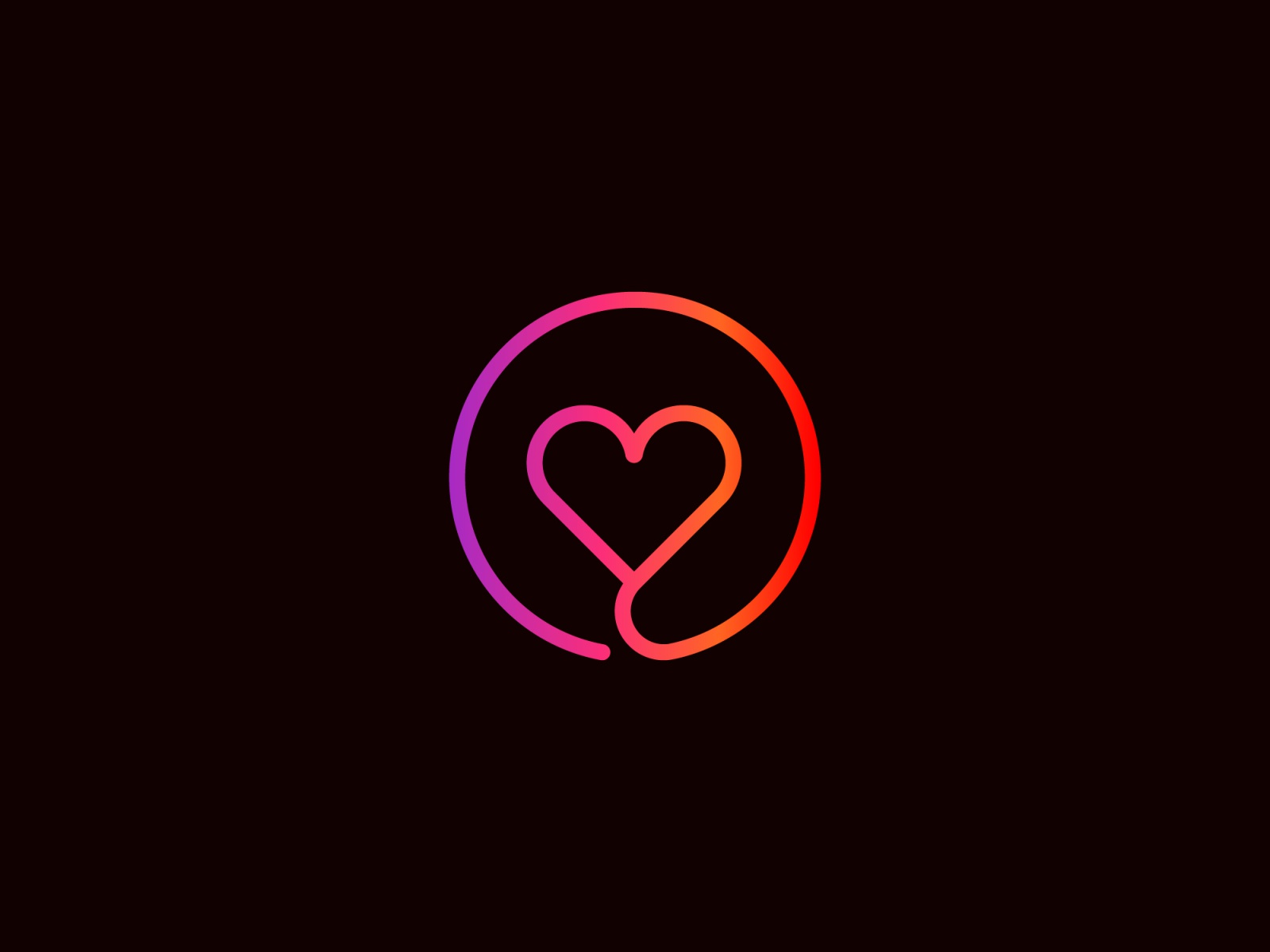
My final logo submission is shown below.
